Want to learn how to create images like this one?
Check out our crash course in prompt engineering & AI art generation!
95ce8da5ca4
posted 9 months ago
43 views
0 comments
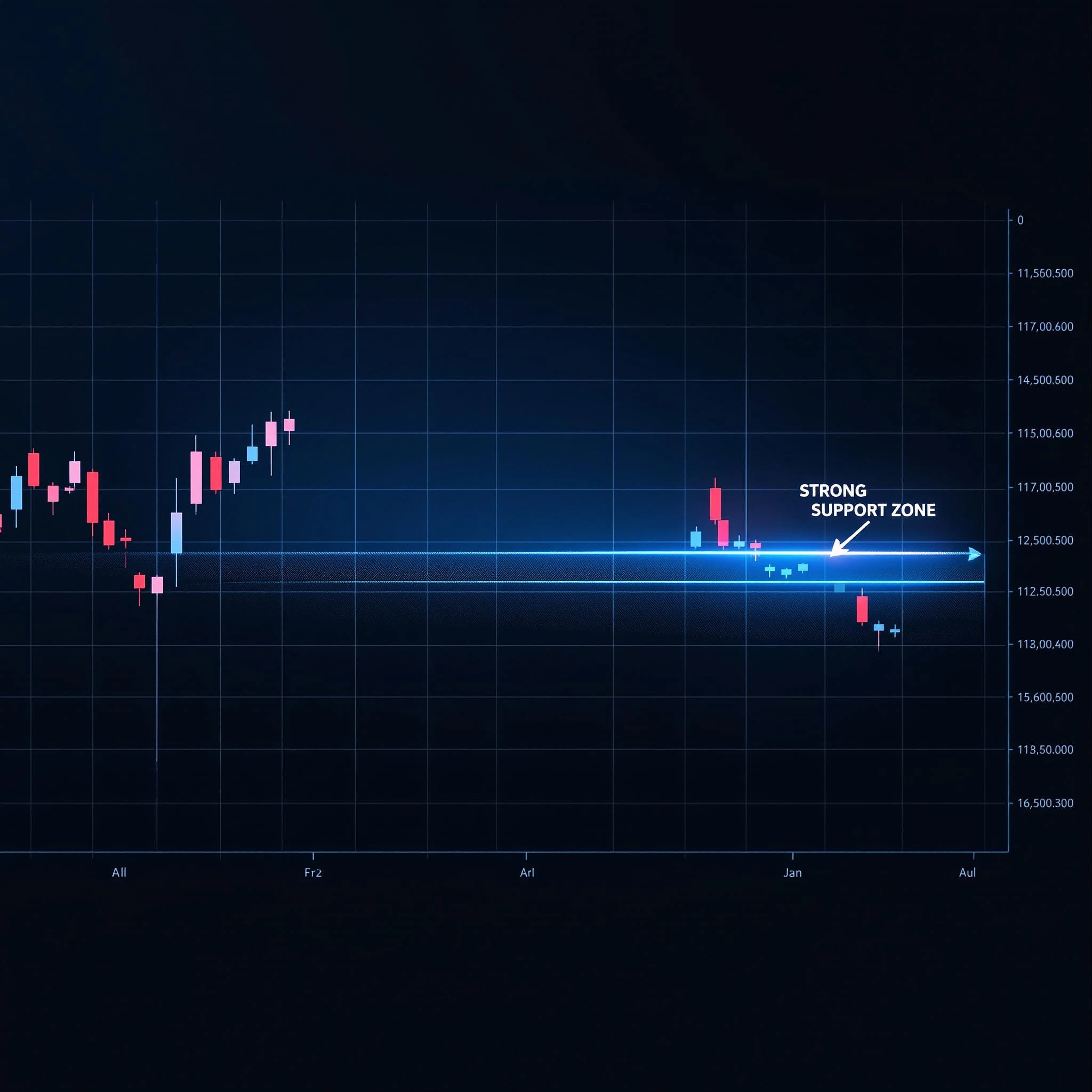
"A highly detailed Forex chart showing a clear downtrend moving towards a strong horizontal support zone.
The chart is set against a dark,
professional background with a sleek and modern design,
perfect for educational purposes.
Chart Details: The chart displays a series of small red candles
(bearish)
moving steadily downward,
indicating a consistent downtrend.
The timeframe
(e.g., daily or 4-hour)
is displayed in the bottom corner,
and the price axis is clearly labeled on the right side.
Support Zone: The horizontal support level is prominently highlighted in a bright,
glowing blue line,
stretching across the chart to emphasize its significance.
The area just above the support zone is shaded with a subtle,
semi-transparent blue to indicate the key level.
Price Action: As the price approaches the support zone,
the red candles become smaller,
suggesting a potential slowdown in selling pressure and the possibility of a reversal or consolidation.
Grid and Structure: Include minimalistic grid lines in a light gray or white,
with low opacity,
to provide structure without overwhelming the chart.
The grid lines should be clean and precise.
Annotations: Add a text label near the support zone that reads ‘Strong Support Zone’ in a modern sans-serif font
(e.g., Roboto or Helvetica)
.
The text should be white or light gray with a subtle shadow for readability.
Background: The background is dark blue or black,
with a slight gradient to add depth.
A faint,
futuristic holographic grid effect can be added to give the chart a high-tech,
professional feel.
Lighting: Use soft lighting effects to highlight the support zone and the approaching price action.
A subtle glow around the support line and candles can make the chart more visually engaging.
Mood: The overall mood should be calm,
analytical,
and educational,
with a focus on clarity and precision.
The design should appeal to traders and students learning about technical analysis.
Additional Elements: Optionally,
include a small arrow pointing toward the support zone with the label ‘Price Approaching Support’ to further emphasize the key concept.
The arrow should be in a contrasting color like white or yellow to stand out.
Color Palette: Use a dark theme with blue accents for the support zone and red for the bearish candles.
The overall design should feel clean,
professional,
and visually appealing.


