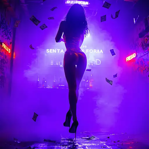
A sample prompt of what you can find in this page
Prompt by 812c6bbb11a

Title Text Stable Diffusion prompts

very few results

3 months ago

🎉 “Happy 10th Anniversary – MaintWiz” Image Type:
Modern, ultra-high resolution digital illustration for corporate social media use. Designed as a LinkedIn banner/post. Overall Artistic Style:
Clean, minimal yet celebratory corporate graphic. Incorporates vibrant gradient colors (blue, gold, and violet), confetti elements, and subtle abstract UI elements from a CMMS dashboard in the background — stylized and non-functional. The design is elegant, professional, and festive, resembling a modern product launch poster. Theme & Messaging:
Celebrates "10th Year Anniversary" of a MaintWiz company. Includes prominent typography for:
“Happy 10th Anniversary” and optionally:
“Empowering Maintenance Intelligence for a Decade” Color Palette: * Primary: Deep blue, royal purple, rich gold gradients * Accents: White, subtle neon/cyan glows * Background: Light blurred gradient or abstract digital waves Lighting & Atmosphere: * Soft glow and rim-lighting from top edges * Clean, professional lighting — no harsh contrast * Slight sparkle/confetti shimmer without overpowering the UI * Positive, celebratory, inspiring mood Subject Details: * No people; instead, show stylized CMMS dashboard or equipment icons in the background * Include 10-year anniversary badge or emblem * Can feature a modern laptop or screen showing abstract CMMS visuals Typography & Layout: * Bold, modern font for “Happy 10th Anniversary” * Balanced layout with space for logo on top-right or bottom * Text should be clean and contrast well with background * Light 3D or embossed effect on main title is allowed Background & Environment: * Abstract futuristic environment: subtle digital grid, transparent charts, or UI windows blending into background * Clean, non-busy background that enhances the central message * Optional use of tech icons subtly integrated Rendering Quality (Crucial): * UltraHD, 4K or 8K resolution * Highly polished vector-style detail * Soft depth of field for slight layering between UI and title * Text and logo areas should be crisp * Gradient blending should be smooth and elegant Negative Prompt (to avoid unwanted elements): "no cartoon style, no party balloons, no people, no childish decorations, no dark lighting, no generic stock photos, no low-resolution, no distorted icons, no overcluttered background, no red color dominance"

7 months ago

## Concept & Design Elements 1. **Overall Theme** - **Look & Feel**: Clean, modern, minimalistic - **Message**: You’re a strategic digital solutions partner offering user-centered innovation - **Color Palette**: A primary color that resonates with you (e.g. a deep teal or navy) plus a bright accent color (e.g. light aqua, coral, or lime). 2. **Background** - Use a **soft gradient** as the base: - For example: **Deep Navy (#0a2239)** fading into **Teal (#1e6f8c)** - Alternatively, a **clean white or very light gray** (#F5F5F5) background with subtle geometric shapes or line art in the corners. 3. **Visual/Graphic Motifs** - **Abstract Geometric Shapes**: Curved lines or subtle wave patterns that hint at “flow” (conveying agile solutions) - **Layered Overlays**: Transparent shapes at low opacity (e.g., 20% of your accent color) to add depth, plus angled lines suggesting forward momentum. - **Iconic Imagery**: A simplified wireframe globe or connected nodes to symbolize digital strategy. Keep it stylized and subtle, not overly busy. 4. **Text Placement & Styling** - **Your Name** (Large, clear font, e.g. Montserrat, Open Sans, or Lato) - A short tagline or brand statement, for instance: > *Digital Solutions & UX Strategist > Empowering Businesses Through User-Centered Innovation* - Keep the text to the left or center, leaving some negative space for a clean appearance. - Make sure fonts are big enough to be legible on multiple devices, especially mobile. 5. **Hierarchy & Balance** - **Name** or main title is the largest text element (e.g., 35–45 px in standard design software). - **Tagline** is smaller (around 20–25 px), italic or a lighter weight to differentiate it. - If desired, include bullet points or tiny icons (no more than 3) that represent key skills: - **UX Strategy** - **Business Transformation** - **Product Development** 6. **Brand Accent** - Use accent color behind a word or phrase in your tagline to draw the eye (e.g., “**Empowering** Businesses Through User-Centered Innovation”). - Consider a small stylized icon (like a light bulb or puzzle piece) near your name for a subtle brand mark. 7. **Exporting the Final Image** - **Aspect Ratio**: 16:9 - **Recommended Dimensions** (for clarity on various platforms): 1920 × 1080 px or 1600 × 900 px - **File Type**: PNG or JPEG for broad compatibility, with at least 72 DPI (consider 150 or 300 DPI if you want a crisp image where possible). --- ## Quick Step-by-Step (If You’re Using a Design Tool Like Canva, Figma, etc.) 1. **Create a 1920×1080 canvas** (16:9 ratio). 2. **Apply a gradient** background (e.g. deep navy to teal) or a light neutral background with abstract shapes. 3. **Add your name** in a prominent spot. 4. **Add a short tagline** underneath or to the side. 5. **Incorporate abstract or geometric elements** (lines, shapes, or icons) at low opacity. 6. **Position text** so it’s clearly visible and not obstructed by platform profile pictures (especially on LinkedIn). 7. **Export** as a high-quality PNG/JPEG. --- ## Example Text Layout (Minimal Option) +---------------------------------------------------------+ | [Soft Gradient Background / Abstract Shapes] | | | | [Your Name Here] | | Digital Solutions & UX Strategist | | Empowering Businesses Through User-Centered Innovation| | | | [Small icons or subtle shapes at bottom corners] | +---------------------------------------------------------+ - **Name** in a strong font (e.g., Montserrat Bold, 40px). - **Sub-text** (tagline) in a lighter weight or smaller size (24px). --- ### Final Tips - Keep the layout uncluttered; negative space is key to a professional vibe. - Test how the image crops on each platform (LinkedIn may place the user’s avatar over the left corner, etc.). - Make sure your accent color doesn’t clash with the text readability. - A short tagline is typically enough—avoid packing too much text into the banner. This design approach should give you a versatile **16:9** header image that visually communicates your new brand identity as a strategic, user-centered digital solutions professional. Feel free to adapt the color palette, shapes, and text style to best reflect your personality and goals.

7 months ago

# Prompt for Image Generation Model ## Book Cover Design: "Technical SEO Deep Dive" by Akramujjaman Mridha Create a professional book cover with the following specifications: ### Core Elements - Title: "Technical SEO Deep Dive" (prominently displayed at top in a modern, tech-inspired font) - Author: "by Akramujjaman Mridha" (placed at bottom in a sleek, minimalist style) - Dimensions: Standard book cover ratio (2:3) - Style: High-quality, professional, digital illustration ### Main Concept Create a visually striking cover that symbolizes the depth and technical nature of SEO through a layered design that incorporates multiple visual metaphors: ### Visual Elements (combine these elements harmoniously) 1. **Primary Background**: A digital landscape where a computer circuit board pattern seamlessly blends into a city skyline, representing the connection between technology and the online world 2. **Secondary Elements**: - An intricate maze formed by lines of code and website wireframes - A deep ocean scene with various SEO challenges represented as underwater elements - Layered infographic-style elements representing different technical SEO components (site speed, mobile optimization, sitemap structure) - Analytics dashboard with performance graphs and metrics 3. **Focal Points**: - A glowing key in the center symbolizing "unlocking" SEO secrets - A magnifying glass highlighting code snippets - Mechanical gears to emphasize the technical aspect ### Color Palette - Primary: Deep blues transitioning to bright blues (ocean/digital theme) - Secondary: Metallic silvers and grays for a professional tech feel - Accent: Subtle neon highlights (green/cyan) to suggest innovation - Overall: Create depth with gradients flowing from dark blue to brighter tones ### Typography - Title: Bold, striking, tech-inspired font that's highly readable - Author name: Smaller, elegant, minimalist font - Both text elements should stand out clearly against the background ### Atmosphere The cover should convey professionalism, technical expertise, and depth of knowledge while remaining visually engaging and modern.