

9 months ago
Persona & Tone: Write as an experienced Digital Solutions & UX Strategist representing DreamLab.Solutions, a forward-thinking brand specializing in user-centered innovation, business transformation, and impactful digital experiences. Structure & Focus: Craft a concise and engaging cover letter (max 350 words) structured into three clear sections: Introduction: Briefly introduce DreamLab.Solutions as a specialized consultancy focused on creating strategic digital experiences and UX-driven solutions. Clearly state excitement about the specific role or collaboration opportunity. Core Strengths & Unique Value: Emphasize expertise in areas such as: UX/UI Strategy and Design Digital Product Development Business Process Optimization and Automation Highlight your holistic approach to design and development—combining thoughtful UX/UI design with robust digital solutions to drive business growth. Include a compelling example (briefly) showcasing a successful outcome achieved by DreamLab.Solutions. Alignment & Closing Statement: Clearly articulate how DreamLab.Solutions aligns uniquely with the company's mission, values, or current digital initiatives. Close by expressing enthusiasm for a discussion and emphasize your readiness to deliver transformative digital solutions. Style Guidelines: Maintain a professional yet approachable tone. Convey confidence without arrogance—demonstrate credibility through concrete examples rather than vague claims. Use keywords relevant to digital transformation, UX strategy, and innovation to enhance alignment. Identity Integration: Integrate DreamLab.Solutions’ core identity attributes naturally into the cover letter, reflecting the brand as innovative, strategic, and user-centered, aiming to empower clients through digital excellence.
0
42

9 months ago
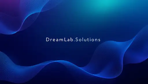
## Concept & Design Elements 1. **Overall Theme** - **Look & Feel**: Clean, modern, minimalistic - **Message**: You’re a strategic digital solutions partner offering user-centered innovation - **Color Palette**: A primary color that resonates with you (e.g. a deep teal or navy) plus a bright accent color (e.g. light aqua, coral, or lime). 2. **Background** - Use a **soft gradient** as the base: - For example: **Deep Navy (#0a2239)** fading into **Teal (#1e6f8c)** - Alternatively, a **clean white or very light gray** (#F5F5F5) background with subtle geometric shapes or line art in the corners. 3. **Visual/Graphic Motifs** - **Abstract Geometric Shapes**: Curved lines or subtle wave patterns that hint at “flow” (conveying agile solutions) - **Layered Overlays**: Transparent shapes at low opacity (e.g., 20% of your accent color) to add depth, plus angled lines suggesting forward momentum. - **Iconic Imagery**: A simplified wireframe globe or connected nodes to symbolize digital strategy. Keep it stylized and subtle, not overly busy. 4. **Text Placement & Styling** - **Your Name** (Large, clear font, e.g. Montserrat, Open Sans, or Lato) - A short tagline or brand statement, for instance: > *Digital Solutions & UX Strategist > Empowering Businesses Through User-Centered Innovation* - Keep the text to the left or center, leaving some negative space for a clean appearance. - Make sure fonts are big enough to be legible on multiple devices, especially mobile. 5. **Hierarchy & Balance** - **Name** or main title is the largest text element (e.g., 35–45 px in standard design software). - **Tagline** is smaller (around 20–25 px), italic or a lighter weight to differentiate it. - If desired, include bullet points or tiny icons (no more than 3) that represent key skills: - **UX Strategy** - **Business Transformation** - **Product Development** 6. **Brand Accent** - Use accent color behind a word or phrase in your tagline to draw the eye (e.g., “**Empowering** Businesses Through User-Centered Innovation”). - Consider a small stylized icon (like a light bulb or puzzle piece) near your name for a subtle brand mark. 7. **Exporting the Final Image** - **Aspect Ratio**: 16:9 - **Recommended Dimensions** (for clarity on various platforms): 1920 × 1080 px or 1600 × 900 px - **File Type**: PNG or JPEG for broad compatibility, with at least 72 DPI (consider 150 or 300 DPI if you want a crisp image where possible). --- ## Quick Step-by-Step (If You’re Using a Design Tool Like Canva, Figma, etc.) 1. **Create a 1920×1080 canvas** (16:9 ratio). 2. **Apply a gradient** background (e.g. deep navy to teal) or a light neutral background with abstract shapes. 3. **Add your name** in a prominent spot. 4. **Add a short tagline** underneath or to the side. 5. **Incorporate abstract or geometric elements** (lines, shapes, or icons) at low opacity. 6. **Position text** so it’s clearly visible and not obstructed by platform profile pictures (especially on LinkedIn). 7. **Export** as a high-quality PNG/JPEG. --- ## Example Text Layout (Minimal Option) +---------------------------------------------------------+ | [Soft Gradient Background / Abstract Shapes] | | | | [Your Name Here] | | Digital Solutions & UX Strategist | | Empowering Businesses Through User-Centered Innovation| | | | [Small icons or subtle shapes at bottom corners] | +---------------------------------------------------------+ - **Name** in a strong font (e.g., Montserrat Bold, 40px). - **Sub-text** (tagline) in a lighter weight or smaller size (24px). --- ### Final Tips - Keep the layout uncluttered; negative space is key to a professional vibe. - Test how the image crops on each platform (LinkedIn may place the user’s avatar over the left corner, etc.). - Make sure your accent color doesn’t clash with the text readability. - A short tagline is typically enough—avoid packing too much text into the banner. This design approach should give you a versatile **16:9** header image that visually communicates your new brand identity as a strategic, user-centered digital solutions professional. Feel free to adapt the color palette, shapes, and text style to best reflect your personality and goals.
0
51

9 months ago
## Concept & Design Elements 1. **Overall Theme** - **Look & Feel**: Clean, modern, minimalistic - **Message**: You’re a strategic digital solutions partner offering user-centered innovation - **Color Palette**: A primary color that resonates with you (e.g. a deep teal or navy) plus a bright accent color (e.g. light aqua, coral, or lime). 2. **Background** - Use a **soft gradient** as the base: - For example: **Deep Navy (#0a2239)** fading into **Teal (#1e6f8c)** - Alternatively, a **clean white or very light gray** (#F5F5F5) background with subtle geometric shapes or line art in the corners. 3. **Visual/Graphic Motifs** - **Abstract Geometric Shapes**: Curved lines or subtle wave patterns that hint at “flow” (conveying agile solutions) - **Layered Overlays**: Transparent shapes at low opacity (e.g., 20% of your accent color) to add depth, plus angled lines suggesting forward momentum. - **Iconic Imagery**: A simplified wireframe globe or connected nodes to symbolize digital strategy. Keep it stylized and subtle, not overly busy. 4. **Text Placement & Styling** - **Your Name** (Large, clear font, e.g. Montserrat, Open Sans, or Lato) - A short tagline or brand statement, for instance: > *Digital Solutions & UX Strategist > Empowering Businesses Through User-Centered Innovation* - Keep the text to the left or center, leaving some negative space for a clean appearance. - Make sure fonts are big enough to be legible on multiple devices, especially mobile. 5. **Hierarchy & Balance** - **Name** or main title is the largest text element (e.g., 35–45 px in standard design software). - **Tagline** is smaller (around 20–25 px), italic or a lighter weight to differentiate it. - If desired, include bullet points or tiny icons (no more than 3) that represent key skills: - **UX Strategy** - **Business Transformation** - **Product Development** 6. **Brand Accent** - Use accent color behind a word or phrase in your tagline to draw the eye (e.g., “**Empowering** Businesses Through User-Centered Innovation”). - Consider a small stylized icon (like a light bulb or puzzle piece) near your name for a subtle brand mark. 7. **Exporting the Final Image** - **Aspect Ratio**: 16:9 - **Recommended Dimensions** (for clarity on various platforms): 1920 × 1080 px or 1600 × 900 px - **File Type**: PNG or JPEG for broad compatibility, with at least 72 DPI (consider 150 or 300 DPI if you want a crisp image where possible). --- ## Quick Step-by-Step (If You’re Using a Design Tool Like Canva, Figma, etc.) 1. **Create a 1920×1080 canvas** (16:9 ratio). 2. **Apply a gradient** background (e.g. deep navy to teal) or a light neutral background with abstract shapes. 3. **Add your name** in a prominent spot. 4. **Add a short tagline** underneath or to the side. 5. **Incorporate abstract or geometric elements** (lines, shapes, or icons) at low opacity. 6. **Position text** so it’s clearly visible and not obstructed by platform profile pictures (especially on LinkedIn). 7. **Export** as a high-quality PNG/JPEG. --- ## Example Text Layout (Minimal Option) +---------------------------------------------------------+ | [Soft Gradient Background / Abstract Shapes] | | | | [Your Name Here] | | Digital Solutions & UX Strategist | | Empowering Businesses Through User-Centered Innovation| | | | [Small icons or subtle shapes at bottom corners] | +---------------------------------------------------------+ - **Name** in a strong font (e.g., Montserrat Bold, 40px). - **Sub-text** (tagline) in a lighter weight or smaller size (24px). --- ### Final Tips - Keep the layout uncluttered; negative space is key to a professional vibe. - Test how the image crops on each platform (LinkedIn may place the user’s avatar over the left corner, etc.). - Make sure your accent color doesn’t clash with the text readability. - A short tagline is typically enough—avoid packing too much text into the banner. This design approach should give you a versatile **16:9** header image that visually communicates your new brand identity as a strategic, user-centered digital solutions professional. Feel free to adapt the color palette, shapes, and text style to best reflect your personality and goals.
0
31
9 months ago
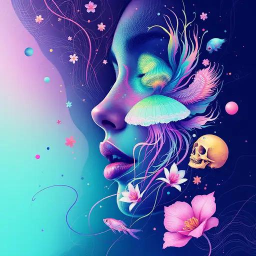
Goddess close-up portrait ribcagel. jellyfish phoenix head, nautilus, orchid, skull, betta fish, bioluminiscent cre## Concept & Design Elements 1. **Overall Theme** - **Look & Feel**: Clean, modern, minimalistic - **Message**: You’re a strategic digital solutions partner offering user-centered innovation - **Color Palette**: A primary color that resonates with you (e.g. a deep teal or navy) plus a bright accent color (e.g. light aqua, coral, or lime). 2. **Background** - Use a **soft gradient** as the base: - For example: **Deep Navy (#0a2239)** fading into **Teal (#1e6f8c)** - Alternatively, a **clean white or very light gray** (#F5F5F5) background with subtle geometric shapes or line art in the corners. 3. **Visual/Graphic Motifs** - **Abstract Geometric Shapes**: Curved lines or subtle wave patterns that hint at “flow” (conveying agile solutions) - **Layered Overlays**: Transparent shapes at low opacity (e.g., 20% of your accent color) to add depth, plus angled lines suggesting forward momentum. - **Iconic Imagery**: A simplified wireframe globe or connected nodes to symbolize digital strategy. Keep it stylized and subtle, not overly busy. 4. **Text Placement & Styling** - **Your Name** (Large, clear font, e.g. Montserrat, Open Sans, or Lato) - A short tagline or brand statement, for instance: > *Digital Solutions & UX Strategist > Empowering Businesses Through User-Centered Innovation* - Keep the text to the left or center, leaving some negative space for a clean appearance. - Make sure fonts are big enough to be legible on multiple devices, especially mobile. 5. **Hierarchy & Balance** - **Name** or main title is the largest text element (e.g., 35–45 px in standard design software). - **Tagline** is smaller (around 20–25 px), italic or a lighter weight to differentiate it. - If desired, include bullet points or tiny icons (no more than 3) that represent key skills: - **UX Strategy** - **Business Transformation** - **Product Development** 6. **Brand Accent** - Use accent color behind a word or phrase in your tagline to draw the eye (e.g., “**Empowering** Businesses Through User-Centered Innovation”). - Consider a small stylized icon (like a light bulb or puzzle piece) near your name for a subtle brand mark. 7. **Exporting the Final Image** - **Aspect Ratio**: 16:9 - **Recommended Dimensions** (for clarity on various platforms): 1920 × 1080 px or 1600 × 900 px - **File Type**: PNG or JPEG for broad compatibility, with at least 72 DPI (consider 150 or 300 DPI if you want a crisp image where possible). --- ## Quick Step-by-Step (If You’re Using a Design Tool Like Canva, Figma, etc.) 1. **Create a 1920×1080 canvas** (16:9 ratio). 2. **Apply a gradient** background (e.g. deep navy to teal) or a light neutral background with abstract shapes. 3. **Add your name** in a prominent spot. 4. **Add a short tagline** underneath or to the side. 5. **Incorporate abstract or geometric elements** (lines, shapes, or icons) at low opacity. 6. **Position text** so it’s clearly visible and not obstructed by platform profile pictures (especially on LinkedIn). 7. **Export** as a high-quality PNG/JPEG. --- ## Example Text Layout (Minimal Option) +---------------------------------------------------------+ | [Soft Gradient Background / Abstract Shapes] | | | | [Your Name Here] | | Digital Solutions & UX Strategist | | Empowering Businesses Through User-Centered Innovation| | | | [Small icons or subtle shapes at bottom corners] | +---------------------------------------------------------+ - **Name** in a strong font (e.g., Montserrat Bold, 40px). - **Sub-text** (tagline) in a lighter weight or smaller size (24px). --- ### Final Tips - Keep the layout uncluttered; negative space is key to a professional vibe. - Test how the image crops on each platform (LinkedIn may place the user’s avatar over the left corner, etc.). - Make sure your accent color doesn’t clash with the text readability. - A short tagline is typically enough—avoid packing too much text into the banner. This design approach should give you a versatile **16:9** header image that visually communicates your new brand identity as a strategic, user-centered digital solutions professional. Feel free to adapt the color palette, shapes, and text style to best reflect your personality and goals.atures, intricate artwork . octane render, trending on artstation,t symmetrical artwork. cinematic, hyper realism, high detail, octane render, 8k
0
64