A sample prompt of what you can find in this page
Prompt by DreamMan

:** * **Clear hierarchy** for Title prompts

very few results

3 months ago

**Generate a book cover concept for a non-fiction business guide.** **Book Title:** [The Highway to Capital:"] **Book Subtitle:** [Your Blueprint for Modern Transport Financing"] **Genre:** Non-fiction, Business, Finance, Transportation. **Overall Style & Tone:** * **Professional yet approachable and dynamic.** * **Modern, clean aesthetic.** * **Empowering and solution-focused.** * **Relatable to practical business owners.** **Key Visual Metaphors & Elements (Specific to Chosen Title):** * **IF TITLE IS "Under the Hood of Funding":** * **Imagery:** Visualize a detailed, well-maintained engine bay of a commercial truck. Focus on clean, intricate mechanical parts. Integrate subtle financial symbols (like rising bar graphs or stylized currency symbols) *within* the engine's glow or as faint blueprint overlays on the components. Show light spilling from under the hood, suggesting revelation or insight. Include elements of a mechanic's tools (e.g., a wrench, a diagnostic device) hinting at practical guidance. * **Color Palette:** Dominant industrial blues, metallic grays, and silver. Accents of warm gold or bright green emanating from the engine's core or financial elements, suggesting money and opportunity. * **Feel:** Precision, insight, understanding, practical knowledge. * **IF TITLE IS "The Access Key: Unlocking Alternative Finance for Transportation Leaders":** * **Imagery:** Show a stylized, modern key (perhaps with a subtle transport symbol on its head, like a truck silhouette) inserting into or turning in an abstract lock mechanism. The lock should open to reveal a pathway, a bright light, or a dynamic upward-trending financial chart stretching into the distance. The background could feature blurred, abstract transport lines or cityscapes. * **Color Palette:** Cool blues, purples, and deep greens for the background/lock. Bright, warm golds, whites, or electric blues for the light and pathway, symbolizing clarity and opportunity. * **Feel:** Breakthrough, solution, clarity, empowerment, opening new possibilities. * **IF TITLE IS "Ignite Your Growth: The Playbook for Transportation Industry Funding":** * **Imagery:** Focus on a dynamic spark or flame igniting. This could be a stylized flame interacting with an abstract representation of a transportation business (e.g., a blurred network of roads, glowing vehicle silhouettes) or a upward-trending growth graph. Integrate subtle elements of a "playbook" or strategic guide (e.g., faint lines, a compass rose, or abstract strategy symbols). * **Color Palette:** Energetic reds, oranges, and yellows for the ignition/spark/growth. Balanced with strong, stable blues and dark grays for the background. * **Feel:** Action, energy, dynamism, growth, strategic advantage. **Typography (General Style for AI):** * **Main Title:** Bold, strong, clean sans-serif font. Highly legible. * **Subtitle:** Slightly lighter weight, complementary sans-serif. Clear and professional. * **Author Name:** Readable, good prominence. **Layout (General Design Principles for AI):** * **Clear hierarchy** for Title, Subtitle, Author Name. * **Dynamic composition** with elements suggesting forward movement or ascent. * **Space for text** (title, subtitle, author) without obscuring key visual. **Generate [3-5] distinct variations for the chosen title.**

1 month ago

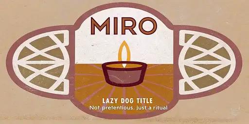
"A flat, printable label design illustration for a 350 ml cold brew coffee bottle. Main Visuals: At the center of the label: a lit candle as the focal point. Above the candle: the brand name ‘MIRO’ in bold Lazy Dog Title font. Directly below: the tagline “Not pretentious. Just a ritual” in Radley Essential font. Surrounding the central imagery: splashes of electric purple, neon pink, and sunshine yellow, interwoven with intricate metallic patterns reminiscent of ancient coffee-making rituals. Additional illustrations of a raven(Light Purple (#EDAFFF) and an owl(Light Purple (#EDAFFF), worked naturally into the design to represent the brand. Layout & Functionality: – Label dimensions: 8.7 inches wide × 2.5 inches tall (wrap-around rectangle). – Aspect ratio: 3.5:1. – Front panel: central imagery, brand name, tagline. – Side panels: leave clear space for nutritional facts, ingredients list, and barcode placeholders. Typography hierarchy: – Headlines → Lazy Dog Title (playful, bold) – Subtext/Menu details → Roboto (clean, versatile) – Highlights/Accents → Radley Essential (stylish, editorial) Color Palette: – Primary: Purple (#7C2271), Pink (#DE689E), Yellow (#FFCE30) – Secondary/Accent: White (#FFFFFF), Orange (#FF9E58), Light Purple (#EDAFFF) Background: – Pink (#DE689E), with bold, modern, premium visual elements of aztec designs and or filipino patterns. – Balanced vibrancy, appealing to Millennial and Gen Z consumers. Output Requirements: – A flat rectangular label, proportionally accurate to 8.7 × 2.5 inches (3.5:1 ratio). – Vector style, sharp lines, high resolution, print-ready. – Include text placeholders for tagline, product info, nutrition, and barcode."

8 months ago

## Concept & Design Elements 1. **Overall Theme** - **Look & Feel**: Clean, modern, minimalistic - **Message**: You’re a strategic digital solutions partner offering user-centered innovation - **Color Palette**: A primary color that resonates with you (e.g. a deep teal or navy) plus a bright accent color (e.g. light aqua, coral, or lime). 2. **Background** - Use a **soft gradient** as the base: - For example: **Deep Navy (#0a2239)** fading into **Teal (#1e6f8c)** - Alternatively, a **clean white or very light gray** (#F5F5F5) background with subtle geometric shapes or line art in the corners. 3. **Visual/Graphic Motifs** - **Abstract Geometric Shapes**: Curved lines or subtle wave patterns that hint at “flow” (conveying agile solutions) - **Layered Overlays**: Transparent shapes at low opacity (e.g., 20% of your accent color) to add depth, plus angled lines suggesting forward momentum. - **Iconic Imagery**: A simplified wireframe globe or connected nodes to symbolize digital strategy. Keep it stylized and subtle, not overly busy. 4. **Text Placement & Styling** - **Your Name** (Large, clear font, e.g. Montserrat, Open Sans, or Lato) - A short tagline or brand statement, for instance: > *Digital Solutions & UX Strategist > Empowering Businesses Through User-Centered Innovation* - Keep the text to the left or center, leaving some negative space for a clean appearance. - Make sure fonts are big enough to be legible on multiple devices, especially mobile. 5. **Hierarchy & Balance** - **Name** or main title is the largest text element (e.g., 35–45 px in standard design software). - **Tagline** is smaller (around 20–25 px), italic or a lighter weight to differentiate it. - If desired, include bullet points or tiny icons (no more than 3) that represent key skills: - **UX Strategy** - **Business Transformation** - **Product Development** 6. **Brand Accent** - Use accent color behind a word or phrase in your tagline to draw the eye (e.g., “**Empowering** Businesses Through User-Centered Innovation”). - Consider a small stylized icon (like a light bulb or puzzle piece) near your name for a subtle brand mark. 7. **Exporting the Final Image** - **Aspect Ratio**: 16:9 - **Recommended Dimensions** (for clarity on various platforms): 1920 × 1080 px or 1600 × 900 px - **File Type**: PNG or JPEG for broad compatibility, with at least 72 DPI (consider 150 or 300 DPI if you want a crisp image where possible). --- ## Quick Step-by-Step (If You’re Using a Design Tool Like Canva, Figma, etc.) 1. **Create a 1920×1080 canvas** (16:9 ratio). 2. **Apply a gradient** background (e.g. deep navy to teal) or a light neutral background with abstract shapes. 3. **Add your name** in a prominent spot. 4. **Add a short tagline** underneath or to the side. 5. **Incorporate abstract or geometric elements** (lines, shapes, or icons) at low opacity. 6. **Position text** so it’s clearly visible and not obstructed by platform profile pictures (especially on LinkedIn). 7. **Export** as a high-quality PNG/JPEG. --- ## Example Text Layout (Minimal Option) +---------------------------------------------------------+ | [Soft Gradient Background / Abstract Shapes] | | | | [Your Name Here] | | Digital Solutions & UX Strategist | | Empowering Businesses Through User-Centered Innovation| | | | [Small icons or subtle shapes at bottom corners] | +---------------------------------------------------------+ - **Name** in a strong font (e.g., Montserrat Bold, 40px). - **Sub-text** (tagline) in a lighter weight or smaller size (24px). --- ### Final Tips - Keep the layout uncluttered; negative space is key to a professional vibe. - Test how the image crops on each platform (LinkedIn may place the user’s avatar over the left corner, etc.). - Make sure your accent color doesn’t clash with the text readability. - A short tagline is typically enough—avoid packing too much text into the banner. This design approach should give you a versatile **16:9** header image that visually communicates your new brand identity as a strategic, user-centered digital solutions professional. Feel free to adapt the color palette, shapes, and text style to best reflect your personality and goals.

8 months ago

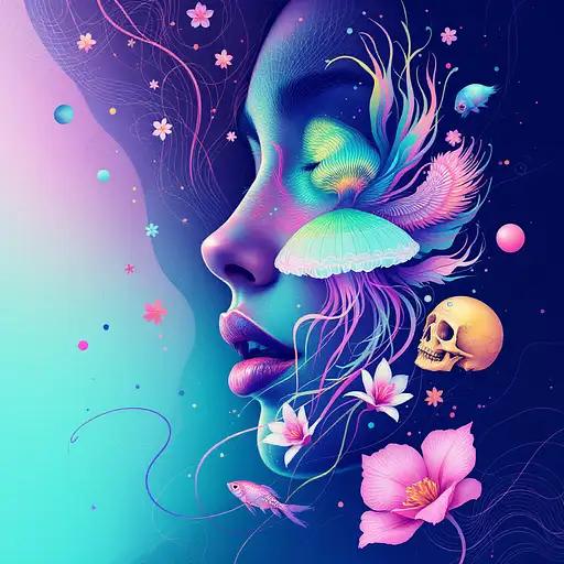
Goddess close-up portrait ribcagel. jellyfish phoenix head, nautilus, orchid, skull, betta fish, bioluminiscent cre## Concept & Design Elements 1. **Overall Theme** - **Look & Feel**: Clean, modern, minimalistic - **Message**: You’re a strategic digital solutions partner offering user-centered innovation - **Color Palette**: A primary color that resonates with you (e.g. a deep teal or navy) plus a bright accent color (e.g. light aqua, coral, or lime). 2. **Background** - Use a **soft gradient** as the base: - For example: **Deep Navy (#0a2239)** fading into **Teal (#1e6f8c)** - Alternatively, a **clean white or very light gray** (#F5F5F5) background with subtle geometric shapes or line art in the corners. 3. **Visual/Graphic Motifs** - **Abstract Geometric Shapes**: Curved lines or subtle wave patterns that hint at “flow” (conveying agile solutions) - **Layered Overlays**: Transparent shapes at low opacity (e.g., 20% of your accent color) to add depth, plus angled lines suggesting forward momentum. - **Iconic Imagery**: A simplified wireframe globe or connected nodes to symbolize digital strategy. Keep it stylized and subtle, not overly busy. 4. **Text Placement & Styling** - **Your Name** (Large, clear font, e.g. Montserrat, Open Sans, or Lato) - A short tagline or brand statement, for instance: > *Digital Solutions & UX Strategist > Empowering Businesses Through User-Centered Innovation* - Keep the text to the left or center, leaving some negative space for a clean appearance. - Make sure fonts are big enough to be legible on multiple devices, especially mobile. 5. **Hierarchy & Balance** - **Name** or main title is the largest text element (e.g., 35–45 px in standard design software). - **Tagline** is smaller (around 20–25 px), italic or a lighter weight to differentiate it. - If desired, include bullet points or tiny icons (no more than 3) that represent key skills: - **UX Strategy** - **Business Transformation** - **Product Development** 6. **Brand Accent** - Use accent color behind a word or phrase in your tagline to draw the eye (e.g., “**Empowering** Businesses Through User-Centered Innovation”). - Consider a small stylized icon (like a light bulb or puzzle piece) near your name for a subtle brand mark. 7. **Exporting the Final Image** - **Aspect Ratio**: 16:9 - **Recommended Dimensions** (for clarity on various platforms): 1920 × 1080 px or 1600 × 900 px - **File Type**: PNG or JPEG for broad compatibility, with at least 72 DPI (consider 150 or 300 DPI if you want a crisp image where possible). --- ## Quick Step-by-Step (If You’re Using a Design Tool Like Canva, Figma, etc.) 1. **Create a 1920×1080 canvas** (16:9 ratio). 2. **Apply a gradient** background (e.g. deep navy to teal) or a light neutral background with abstract shapes. 3. **Add your name** in a prominent spot. 4. **Add a short tagline** underneath or to the side. 5. **Incorporate abstract or geometric elements** (lines, shapes, or icons) at low opacity. 6. **Position text** so it’s clearly visible and not obstructed by platform profile pictures (especially on LinkedIn). 7. **Export** as a high-quality PNG/JPEG. --- ## Example Text Layout (Minimal Option) +---------------------------------------------------------+ | [Soft Gradient Background / Abstract Shapes] | | | | [Your Name Here] | | Digital Solutions & UX Strategist | | Empowering Businesses Through User-Centered Innovation| | | | [Small icons or subtle shapes at bottom corners] | +---------------------------------------------------------+ - **Name** in a strong font (e.g., Montserrat Bold, 40px). - **Sub-text** (tagline) in a lighter weight or smaller size (24px). --- ### Final Tips - Keep the layout uncluttered; negative space is key to a professional vibe. - Test how the image crops on each platform (LinkedIn may place the user’s avatar over the left corner, etc.). - Make sure your accent color doesn’t clash with the text readability. - A short tagline is typically enough—avoid packing too much text into the banner. This design approach should give you a versatile **16:9** header image that visually communicates your new brand identity as a strategic, user-centered digital solutions professional. Feel free to adapt the color palette, shapes, and text style to best reflect your personality and goals.atures, intricate artwork . octane render, trending on artstation,t symmetrical artwork. cinematic, hyper realism, high detail, octane render, 8k

8 months ago

## Concept & Design Elements 1. **Overall Theme** - **Look & Feel**: Clean, modern, minimalistic - **Message**: You’re a strategic digital solutions partner offering user-centered innovation - **Color Palette**: A primary color that resonates with you (e.g. a deep teal or navy) plus a bright accent color (e.g. light aqua, coral, or lime). 2. **Background** - Use a **soft gradient** as the base: - For example: **Deep Navy (#0a2239)** fading into **Teal (#1e6f8c)** - Alternatively, a **clean white or very light gray** (#F5F5F5) background with subtle geometric shapes or line art in the corners. 3. **Visual/Graphic Motifs** - **Abstract Geometric Shapes**: Curved lines or subtle wave patterns that hint at “flow” (conveying agile solutions) - **Layered Overlays**: Transparent shapes at low opacity (e.g., 20% of your accent color) to add depth, plus angled lines suggesting forward momentum. - **Iconic Imagery**: A simplified wireframe globe or connected nodes to symbolize digital strategy. Keep it stylized and subtle, not overly busy. 4. **Text Placement & Styling** - **Your Name** (Large, clear font, e.g. Montserrat, Open Sans, or Lato) - A short tagline or brand statement, for instance: > *Digital Solutions & UX Strategist > Empowering Businesses Through User-Centered Innovation* - Keep the text to the left or center, leaving some negative space for a clean appearance. - Make sure fonts are big enough to be legible on multiple devices, especially mobile. 5. **Hierarchy & Balance** - **Name** or main title is the largest text element (e.g., 35–45 px in standard design software). - **Tagline** is smaller (around 20–25 px), italic or a lighter weight to differentiate it. - If desired, include bullet points or tiny icons (no more than 3) that represent key skills: - **UX Strategy** - **Business Transformation** - **Product Development** 6. **Brand Accent** - Use accent color behind a word or phrase in your tagline to draw the eye (e.g., “**Empowering** Businesses Through User-Centered Innovation”). - Consider a small stylized icon (like a light bulb or puzzle piece) near your name for a subtle brand mark. 7. **Exporting the Final Image** - **Aspect Ratio**: 16:9 - **Recommended Dimensions** (for clarity on various platforms): 1920 × 1080 px or 1600 × 900 px - **File Type**: PNG or JPEG for broad compatibility, with at least 72 DPI (consider 150 or 300 DPI if you want a crisp image where possible). --- ## Quick Step-by-Step (If You’re Using a Design Tool Like Canva, Figma, etc.) 1. **Create a 1920×1080 canvas** (16:9 ratio). 2. **Apply a gradient** background (e.g. deep navy to teal) or a light neutral background with abstract shapes. 3. **Add your name** in a prominent spot. 4. **Add a short tagline** underneath or to the side. 5. **Incorporate abstract or geometric elements** (lines, shapes, or icons) at low opacity. 6. **Position text** so it’s clearly visible and not obstructed by platform profile pictures (especially on LinkedIn). 7. **Export** as a high-quality PNG/JPEG. --- ## Example Text Layout (Minimal Option) +---------------------------------------------------------+ | [Soft Gradient Background / Abstract Shapes] | | | | [Your Name Here] | | Digital Solutions & UX Strategist | | Empowering Businesses Through User-Centered Innovation| | | | [Small icons or subtle shapes at bottom corners] | +---------------------------------------------------------+ - **Name** in a strong font (e.g., Montserrat Bold, 40px). - **Sub-text** (tagline) in a lighter weight or smaller size (24px). --- ### Final Tips - Keep the layout uncluttered; negative space is key to a professional vibe. - Test how the image crops on each platform (LinkedIn may place the user’s avatar over the left corner, etc.). - Make sure your accent color doesn’t clash with the text readability. - A short tagline is typically enough—avoid packing too much text into the banner. This design approach should give you a versatile **16:9** header image that visually communicates your new brand identity as a strategic, user-centered digital solutions professional. Feel free to adapt the color palette, shapes, and text style to best reflect your personality and goals.

2 months ago

Layout Structure and Composition: - Overall composition: Symmetrical grid-based layout for a clean, professional feel, divided into three horizontal sections to guide the eye from top to bottom (headline → content → CTA). This ensures quick scannability in 10 seconds or less on Instagram feeds. - Top section (20% of canvas): Centered headline with subtle tech overlay (e.g., faint binary code or circuit board pattern) for a technical vibe. - Middle section (60% of canvas): 3x3 grid showcasing key data points from the Excel sheet. Each cell features one category (e.g., Files & Navigating) with 2-3 highlighted command examples. Use icons (e.g., folder icon for Files, CPU icon for System Info) to visually separate categories. Background has a subtle gradient fade for depth. - Bottom section (20% of canvas): Centered CTA with a button-like element (rounded rectangle with arrow icon) to encourage interaction. Include a small footer with hashtag cloud (#LinuxTips #CommandLine #SysAdmin) and a subtle brand watermark (e.g., abstract terminal prompt icon). - Spacing: 50px margins on all sides for breathing room; elements aligned to a 12-column grid for precision. High-contrast elements ensure mobile visibility. Color Scheme with Hex Codes: - Primary background: Linear gradient from deep teal (#008080) at top to lighter teal (#20B2AA) at bottom for a vibrant, tech-inspired flow. - Accent colors: Bold orange (#FF4500) for headlines and icons to create high contrast and energy; navy blue (#001F3F) for text and borders for professionalism. - Neutral tones: White (#FFFFFF) for main text on dark backgrounds; light gray (#D3D3D3) for subtle dividers and secondary text. - High contrast ratio: All text elements maintain at least 4.5:1 contrast (e.g., white on teal) for accessibility and vibrancy. Typography Choices: - Headline font: Montserrat Bold (sans-serif, modern tech feel) at 72pt for the main title, with tracking at 50 for openness. - Subheadline/Category titles: Roboto Medium (clean, readable) at 36pt, all caps for hierarchy. - Body text (command examples): Source Code Pro Regular (monospace for code authenticity) at 24pt, with line height 1.2 for dense but legible lists. - CTA font: Montserrat SemiBold at 48pt, italicized for urgency. - Hierarchy: Bold for key terms (e.g., command names like "ls -l"); italic for descriptions. Limit to 2-3 fonts total for cohesion. Data Visualization Approach: - Approach: Simplified infographic-style grid to visualize the Excel data without overwhelming. Select 9 key data points (one per grid cell) from the sheet, prioritizing essentials: e.g., from "Files & Navigating" (ls -l, cd foldername); "System Info" (top, hostname); "Networking" (ip addr show, ss -tuln); etc. Avoid completeness—focus on high-value, beginner-friendly commands to drive conversions (e.g., encourage full cheatsheet downloads). - Visualization types: Icon-based bullets for each command (e.g., arrow icon before "ls -l - List all files..."). Use a subtle bar chart in one cell (e.g., for Processes category) showing "priority levels" (nice/renice) as horizontal bars in orange/teal for visual interest. - Simplification: Phrase fragments only (e.g., "ls -l: Detailed file list"); bold command strings for emphasis. If jargon exceeds basics (e.g., "ss -tuln"), add a tiny tooltip icon linking to a story highlight in the post caption. Marketing Elements Placement: - Compelling headline: "Level Up Your Linux Skills: Top Commands Cheatsheet!" centered at top, with orange glow effect for vibrancy. - Key data points: Integrated into the middle grid—e.g., top-left cell: "Files & Navigating" with bullets like "**ls -l**: Detailed file list", "**cd ..**: Back to parent dir". Use orange highlights on commands to draw eyes. - Clear call-to-action: "Get the Full Guide – DM 'LINUX' Now!" in a orange-bordered button at bottom-center, with a right-arrow icon for directionality. - Subtle technical/marketing cues: Faint terminal window frame around the grid; motivational micro-copy like "Boost Productivity Today!" in small teal text. Hashtags and brand icon (e.g., stylized penguin for Linux) in footer to encourage shares and follows. Technical Specifications for Implementation in Photoshop: - Canvas setup: New document at 1080x1080 pixels, 72 DPI (RGB color mode for digital), background contents transparent initially for layering. - Layers organization: Group into folders – "Background" (gradient layer with Overlay blend mode for pattern); "Headline" (text layer with Drop Shadow: opacity 20%, distance 5px, black color); "Grid Content" (shape layers for grid lines at 1px stroke, #D3D3D3; smart objects for icons from free packs like Flaticon); "CTA" (rounded rectangle tool with 20px radius, fill #FF4500, stroke none); "Effects" (adjustment layers for overall vibrancy: Hue/Saturation +20 on orange channel). - Effects and filters: Apply Gaussian Blur (2px) to background pattern for subtlety; use Layer Styles for text (e.g., Outer Glow on headline: blend mode Screen, opacity 50%, #FF4500). For icons, use Color Overlay to match palette. - Export: Save as PSD for edits; export as JPEG (quality 90) or PNG for transparency if needed. Optimize file size under 1MB using Image > Image Size (resample Bicubic) and File > Export > Export As with compression. - Best practices: Use guides (View > New Guide Layout: 3 columns, 3 rows, 20px gutter) for alignment; non-destructive editing with masks; test on mobile preview (Window > Device Preview) for Instagram scaling.