A sample prompt of what you can find in this page
Prompt by c6fcb537fab

common prompts

very few results

1 month ago

Create an image for me that fits DIN A4. A beautiful woman with an african background. It should be a portrait in black and white – creative – surreal – abstract – with a reference to migration. Feel free to play with motion blur (but not too much – perhaps a subtle motion blur). The motif should be darker. The background should be light. Magazine editorial style. And please only the person. No other motifs. (The portrait will later be edited with a coloured background and text will be added – but I will do that myself). In photography, there are various rules and techniques for improving image composition, including the rule that people in the image should not look out of the frame. This is often considered part of image composition, as it is intended to draw the viewer's attention to the most important elements in the image. If a person is looking at the edge of the image, this can often create a feeling of incompleteness and distract the viewer from the main focus. A common practice is to position the person so that they are looking into the image rather than out of it. This creates a connection between the subject and the viewer and can enhance the emotional impact of the image. For example, if a person is looking to the left, the focus of the image should be on leaving enough space on the right side of the image to show the movement of the gaze. This technique goes hand in hand with other photographic rules, such as the rule of thirds or the golden ratio, which serve to harmonise the composition and increase visual interest. Only the person! No animals! No motion blur in the face!

6 months ago

An 80s senior portrait photo with a side-view double exposure in the top left. Subject: Blonde woman in her senior year of high school, with her hair in a high ponytail. She has blue eyes and a friendly smile. In the main photo she is saluting the viewer. In the double exposure she is in a side-view, looking upward. Clothing: The individual in the image is wearing a black and white color-blocked blouse with a sharp collar, paired with a high-waisted, gingham-patterned skirt in shades of black, white, and possibly gray. The blouse has an oversized fit, while the skirt is fitted at the waist and flares out slightly. The individual is also holding a black handbag with a structured design. She is wearing large dangling black and white earrings. In the double exposure image she is wearing a letterman's jacket for Adams High School and holding a tennis racket. In this double exposure her hair is down. Photographic Features Double exposure: The image includes a side view of the woman as a double exposure that is large and overlapping the main image and should fill the upper left quadrant. In traditional film photography, double exposure involves exposing the same frame of film twice. The photographer would first take the main portrait shot. Then, without advancing the film, they would take a second shot of the subject’s face, often with a different lighting setup to create a softer, ethereal look. This would result in both images being superimposed on the same frame. This photo should be feathered to allow the backgrounds still blend together without a harsh background outline. Lighting: The lighting in these photos was typically studio lighting, which was bright and even, minimizing shadows. The superimposed face often had a soft, diffused light to give it an ethereal, almost heavenly glow. Depth of Field: The main image usually had a sharp focus, capturing the details of the subjects. The superimposed face, however, was often slightly blurred or softened to create a dreamy effect and to distinguish it from the main image. Color Grading: The colors in these photos were often vibrant and saturated, typical of the film used during that era. The superimposed face might have a slightly different color tone, often with a bluish or purplish tint to enhance the dreamy, otherworldly effect. Camera Used: These portraits were typically taken with medium-format or 35mm film cameras, which were common in professional photography studios at the time. Film Used: The film used was usually color negative film, which was popular for its ability to capture vibrant colors and fine details. Brands like Kodak and Fujifilm were commonly used. Age of Photo: These types of portraits were particularly popular in the late 70s and throughout the 80s. The fashion styles, hairstyles, and overall aesthetic are strong indicators of this time period. Overall Impression These portraits have a nostalgic charm and are often remembered fondly for their unique and somewhat whimsical style. They capture a moment in time and reflect the photographic trends and techniques of the era.

3 months ago

[Image Type: Ultra-realistic color photograph / Highly detailed realistic oil painting / High-resolution digital portrait] of a young Marie Curie. Facial Details: Face Shape: Oval-shaped, with slightly prominent cheekbones and a soft jawline. Skin Tone: Fair complexion with a subtle rosy undertone, showing natural skin texture and pores. The skin should appear very smooth and youthful, with minimal to no visible lines or wrinkles. Hair: Color: Light to medium brown, possibly with hints of auburn or golden tones. Style: Often styled in an updo, with soft curls or waves framing the face. The hair may be fuller and more voluminous than in older depictions. Eyes: Color: Light blue or blue-grey, with a bright and intelligent gaze. Shape: Almond to slightly round, with a youthful openness. Eyelashes and Eyebrows: Eyelashes are present but not heavily emphasized. Eyebrows are thin to medium, naturally arched, and light brown in color. Nose: Straight, medium-sized, and well-defined, with a slightly rounded tip. Mouth and Lips: Medium-full lips, natural rosy-pink color, often closed with a calm or slightly serious expression. Chin: Rounded and soft, proportionate to the face shape. Body and Clothing Details (if more than the face is included): Body Build: Slender and youthful. Clothing: Often depicted in the fashion of the late 19th and early 20th centuries, such as: High-necked dresses or blouses, often with lace or decorative collars. Dark colors are common, but lighter tones may also be present. Background and Lighting: Background: Simple, often a plain neutral-colored wall or a softly blurred, indistinct background. Lighting: Soft, even lighting that highlights the youthful features. Overall Mood/Feeling: Intelligent, determined, and with a hint of youthful enthusiasm.

9 months ago

How to Interact Like a Pro on Facebook: Essential Tips and Common Pitfalls Facebook, with its 3 billion users, offers a plethora of interaction options. The way you manage these interactions can greatly influence your online presence. This guide breaks down the seven key interactions you can have on Facebook and highlights best practices as well as mistakes to avoid for each category. Understanding Facebook Interactions Like Comment Share Send Messages Accept Invitations Send Invites Poke 1. Managing Likes Best Practices: Only like interesting posts from your friends using friend lists. Show appreciation for your favorite pages' content once or twice a month. Common Mistakes to Avoid: Liking Your Own Posts: Never like your personal posts; it reduces authenticity. Supporting Bad Content: Avoid liking negative posts from friends, as this can undermine your reputation. Over-Liking: Don't like posts in groups or pages excessively. Profile Pictures: Never like friends' profile pictures; it can come off as inappropriate. 2. Managing Comments Best Practices: Use positive and uplifting stickers when commenting on friends' posts. Engage briefly with one or two of your own post's comments to keep them active. Common Mistakes to Avoid: Commenting in Groups: Avoid commenting in groups, as it can dilute your personal brand. Negativity: Steer clear of negative comments, as they can drive people away. 3. Managing Shares Best Practices: Gradually increase your sharing frequency: Start with one share every 48 hours, then progress to four per day. Share birthday photos on friends’ timelines to enhance visibility. Common Mistakes to Avoid: Direct Sharing: Never share posts directly from pages or groups to your profile without personal context. 4. Poke Management Best Practices: Respond to anyone who pokes you, but refrain from initiating pokes yourself. 5. Message Management Best Practices: Stick to using positive and cheerful stickers in direct messages. Common Mistakes to Avoid: Game Requests: Avoid sending game requests, as they can annoy recipients. 6. Friend Management Best Practices: Engage with your friends’ posts positively with comments such as “Gorgeous!” or “Too cute!”. Use varied emojis based on the content shared to show genuine interaction. Common Mistakes to Avoid: Ignoring Posts: Don’t overlook interesting posts from friends—visit friend lists regularly to stay updated. 7. Invitation Management Best Practices: Send requests to individuals with clear profile pictures and shared interests. Common Mistakes to Avoid: Inviting Strangers: Don’t invite those without identifiable profile pictures or mutual interests, as this can come off as spammy. 8. Managing Acceptances Best Practices: After accepting a new friend, organize them into lists based on interests and relationships. Common Mistakes to Avoid: Unqualified Acceptances: Never accept friend requests from people with unclear profiles. Conclusion By following these interaction strategies, you can enhance your presence on Facebook effectively. Maintain control over your account by adhering to best practices while being mindful of common pitfalls. Remember, consistency is key, so give yourself 48 hours of daily management to start seeing results. Adapt your approach according to your personal preferences, and enjoy navigating the world’s largest social network securely and effectively!

5 months ago

# Comic Book Love Story: "A Dream in Disguise" - Panel Prompts ## Common Elements for All Panels: Story Summary: A love story between Victor (black male mannequin) and Viola (white female mannequin) in a NYC department store. Both drawn in A-ha "Take on Me" pencil sketch style against hyperrealistic colored backgrounds. Setting: Busy New York department store with Brooklyn Bridge visible through windows, sunny winter morning. Outfits: Both wear H&M winter clothes - Victor in blue jeans and grey long coat with golden zipper; Viola in tight blue jeans, black belt and loosely opened blue coat. Both have red beanies, blue scarves, and warm yellow gloves. ## Panel 1: A pencil-sketch black male mannequin (Victor) and white female mannequin (Viola) standing apart in a hyperrealistic colored busy department store. Brooklyn Bridge visible through windows. Victor gazes at Viola with a heart-shaped thought bubble above his head. Morning sunlight streams through windows. A-ha "Take on Me" sketch style for mannequins only. No text, only emotions through thought bubbles. ## Panel 2: Close-up of Victor's face in A-ha pencil sketch style, wearing red beanie and blue scarf. Intense gaze toward Viola (slightly blurred in foreground). Hyperrealistic colored Brooklyn Bridge visible through windows. Thought bubble above Victor contains multiple hearts and Cupid's arrows. Winter sunlight casting dramatic shadows. No text. ## Panel 3: Victor in pencil sketch style at colorful flower vendor, selecting a single red rose. Still in winter H&M outfit. Hyperrealistic colored busy NYC department store background. Brooklyn Bridge visible. Thought bubble shows question mark. Colored shoppers rushing past contrast with sketch-style Victor. Warm sunlight effect. No text. ## Panel 4: Victor walking purposefully through department store displays, holding red rose. A-ha pencil sketch style. Hyperrealistic colored background. Brooklyn Bridge through windows. Thought bubble shows stick figure running. Victor's determined expression contrasts with busy store environment. Strong directional lighting. No text. ## Panel 5: Victor and Viola face-to-face in pencil sketch style. Hyperrealistic colored NYC department store background with Brooklyn Bridge. Victor holding rose toward Viola who leans toward him. Thought bubble above Victor shows surprised emoji. Winter light creates dramatic atmosphere. No text. ## Panel 6: Victor and Viola embracing in kiss, pencil sketch style with glowing aura. Hyperrealistic colored Brooklyn Bridge background. Still in winter H&M outfits. Two connected red hearts floating above them. Sunbeams highlighting their embrace. Magical atmosphere. No text, pure emotion.

19 days ago

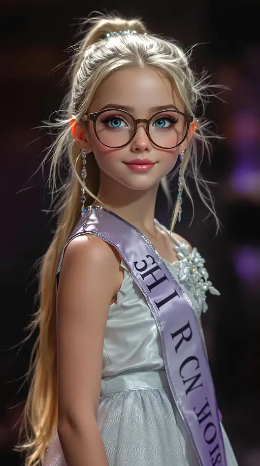
djrny-v4 style, score_13, score_28_up, score_37_up, A professional photograph of the most beautiful second-grade girl in the world, participating in a beauty pageant. The image is highly detailed and realistic, showcasing her full body. She has long sandy blonde hair styled in a ponytail and flawlessly smooth light olive skin. Her makeup includes thick black eyeliner, exceptionally long eyelashes, light pink blush, exquisitely shaped lips with light pink lipstick, and peach eyeshadow. Her olive skin is perfectly flawless, complemented by beautifully defined high cheekbones. Her large, brilliantly shaped eyes display a unique forest tea blue-grey-purple hue wear harry potter style glasses, rendered with extreme detail. Her fingernails are beautifully manicured with pink polish. She is dressed in common cloths of her choice, standing on a stage and looking directly at the photographer. The photograph features a high depth of field and is created using Unreal Engine 5 and Octane Render, resulting in a high-resolution image with intricate details and ultra-sharp focus. The image is of the highest quality, 8K resolution, ultra-detailed, and photo-realistic, presented in a front full-body view with dramatic volumetric lighting and perfect graphics. Negative prompts exclude Asian features, low resolution, text, errors, cropped images, poor quality, and various anatomical inaccuracies such as extra or mutated limbs, poorly drawn features, and watermarks or signatures.