A sample prompt of what you can find in this page
Prompt by Ib__Te__Ra__Kh

filled with documents prompts

very few results

8 months ago

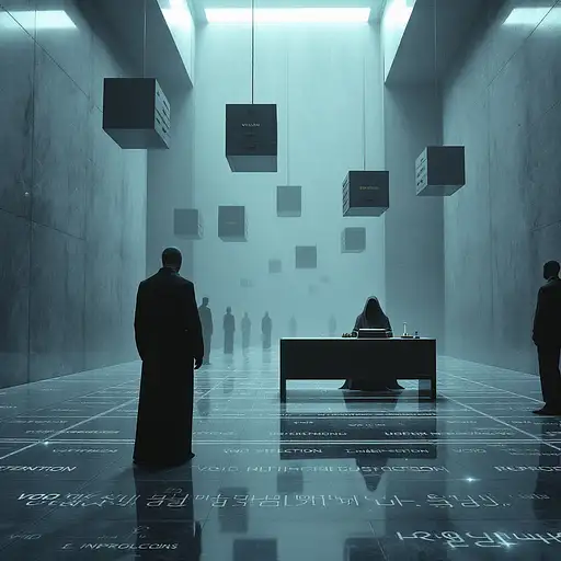
The Bureaucracy of the Afterlife" – (Primary Subject: Faceless Clerk Processing a Soul in an Afterlife Bureaucracy, 1.7 weight) — inside an impossibly vast brutalist marble hall, illuminated by soft shafts of gray ambient light and flickering fluorescent tubes, a lone soul stands in a queue that stretches far into vanishing point. The silence is immense. The walls are cold and unmarked. The floor glows faintly underfoot, inscribed with looping scripts in forgotten divine languages. At the end of the queue is a polished obsidian desk, minimalist and imposing. Behind it sits a faceless bureaucrat, their form static, draped in slate-gray robes. In front of them: a glowing typewriter that types without sound, a massive ledger filled with names and karmic equations, and a small brass stamp marked VOID, REDEEMED, or REPROCESS. Floating overhead are rotating file cabinets suspended in mid-air, each one labeled with vague existential terms: INTENTION, UNSPOKEN REGRET, MIRRORED VERSIONS. Pneumatic tubes hiss gently as they deliver paperwork from unknown origins. Occasionally, one bursts open and spills glowing red or golden documents onto the polished floor, which janitors in silence quickly retrieve. The architecture is surreal: escalators that lead nowhere, elevators with no doors, rows of waiting souls seated on concrete benches that pulse with low-frequency light. A clock with no hands ticks anyway. There is no signage—only understanding. The atmosphere is subdued and dreamlike: hazy, gray-toned air, volumetric light rays filtering from clerestory windows high above, and a dull mechanical hum as background music. The entire space feels endless, and yet incredibly personal—like a divine DMV designed by Tarkovsky and Escher. Rendered in moody cinematic realism with vintage textures—muted color palette of ashen gray, faded gold, bureaucratic beige, and deep obsidian black. Fine film grain, soft lens flare, and subtle vignetting give the image a faded, spiritual authority. Captured in the style of a Leica Summilux lens on decaying 35mm stock (emotional analog realism, 1.3 weight).

3 months ago

Layout Structure and Composition: - Overall composition: Symmetrical grid-based layout for a clean, professional feel, divided into three horizontal sections to guide the eye from top to bottom (headline → content → CTA). This ensures quick scannability in 10 seconds or less on Instagram feeds. - Top section (20% of canvas): Centered headline with subtle tech overlay (e.g., faint binary code or circuit board pattern) for a technical vibe. - Middle section (60% of canvas): 3x3 grid showcasing key data points from the Excel sheet. Each cell features one category (e.g., Files & Navigating) with 2-3 highlighted command examples. Use icons (e.g., folder icon for Files, CPU icon for System Info) to visually separate categories. Background has a subtle gradient fade for depth. - Bottom section (20% of canvas): Centered CTA with a button-like element (rounded rectangle with arrow icon) to encourage interaction. Include a small footer with hashtag cloud (#LinuxTips #CommandLine #SysAdmin) and a subtle brand watermark (e.g., abstract terminal prompt icon). - Spacing: 50px margins on all sides for breathing room; elements aligned to a 12-column grid for precision. High-contrast elements ensure mobile visibility. Color Scheme with Hex Codes: - Primary background: Linear gradient from deep teal (#008080) at top to lighter teal (#20B2AA) at bottom for a vibrant, tech-inspired flow. - Accent colors: Bold orange (#FF4500) for headlines and icons to create high contrast and energy; navy blue (#001F3F) for text and borders for professionalism. - Neutral tones: White (#FFFFFF) for main text on dark backgrounds; light gray (#D3D3D3) for subtle dividers and secondary text. - High contrast ratio: All text elements maintain at least 4.5:1 contrast (e.g., white on teal) for accessibility and vibrancy. Typography Choices: - Headline font: Montserrat Bold (sans-serif, modern tech feel) at 72pt for the main title, with tracking at 50 for openness. - Subheadline/Category titles: Roboto Medium (clean, readable) at 36pt, all caps for hierarchy. - Body text (command examples): Source Code Pro Regular (monospace for code authenticity) at 24pt, with line height 1.2 for dense but legible lists. - CTA font: Montserrat SemiBold at 48pt, italicized for urgency. - Hierarchy: Bold for key terms (e.g., command names like "ls -l"); italic for descriptions. Limit to 2-3 fonts total for cohesion. Data Visualization Approach: - Approach: Simplified infographic-style grid to visualize the Excel data without overwhelming. Select 9 key data points (one per grid cell) from the sheet, prioritizing essentials: e.g., from "Files & Navigating" (ls -l, cd foldername); "System Info" (top, hostname); "Networking" (ip addr show, ss -tuln); etc. Avoid completeness—focus on high-value, beginner-friendly commands to drive conversions (e.g., encourage full cheatsheet downloads). - Visualization types: Icon-based bullets for each command (e.g., arrow icon before "ls -l - List all files..."). Use a subtle bar chart in one cell (e.g., for Processes category) showing "priority levels" (nice/renice) as horizontal bars in orange/teal for visual interest. - Simplification: Phrase fragments only (e.g., "ls -l: Detailed file list"); bold command strings for emphasis. If jargon exceeds basics (e.g., "ss -tuln"), add a tiny tooltip icon linking to a story highlight in the post caption. Marketing Elements Placement: - Compelling headline: "Level Up Your Linux Skills: Top Commands Cheatsheet!" centered at top, with orange glow effect for vibrancy. - Key data points: Integrated into the middle grid—e.g., top-left cell: "Files & Navigating" with bullets like "**ls -l**: Detailed file list", "**cd ..**: Back to parent dir". Use orange highlights on commands to draw eyes. - Clear call-to-action: "Get the Full Guide – DM 'LINUX' Now!" in a orange-bordered button at bottom-center, with a right-arrow icon for directionality. - Subtle technical/marketing cues: Faint terminal window frame around the grid; motivational micro-copy like "Boost Productivity Today!" in small teal text. Hashtags and brand icon (e.g., stylized penguin for Linux) in footer to encourage shares and follows. Technical Specifications for Implementation in Photoshop: - Canvas setup: New document at 1080x1080 pixels, 72 DPI (RGB color mode for digital), background contents transparent initially for layering. - Layers organization: Group into folders – "Background" (gradient layer with Overlay blend mode for pattern); "Headline" (text layer with Drop Shadow: opacity 20%, distance 5px, black color); "Grid Content" (shape layers for grid lines at 1px stroke, #D3D3D3; smart objects for icons from free packs like Flaticon); "CTA" (rounded rectangle tool with 20px radius, fill #FF4500, stroke none); "Effects" (adjustment layers for overall vibrancy: Hue/Saturation +20 on orange channel). - Effects and filters: Apply Gaussian Blur (2px) to background pattern for subtlety; use Layer Styles for text (e.g., Outer Glow on headline: blend mode Screen, opacity 50%, #FF4500). For icons, use Color Overlay to match palette. - Export: Save as PSD for edits; export as JPEG (quality 90) or PNG for transparency if needed. Optimize file size under 1MB using Image > Image Size (resample Bicubic) and File > Export > Export As with compression. - Best practices: Use guides (View > New Guide Layout: 3 columns, 3 rows, 20px gutter) for alignment; non-destructive editing with masks; test on mobile preview (Window > Device Preview) for Instagram scaling.

5 months ago

"Design a modern, minimalist, and innovative logo for an application named 'Generating Content AI'. The logo should be the primary focus, rendered at a large, clear size without any background. The goal is to create a standalone, impactful graphic. Key Elements to Integrate (subtly and abstractly): AI / Intelligence: An abstract, sleek, or subtly geometric representation of AI (e.g., interconnected nodes, a stylized brain-like shape, a glowing core, or an abstract data flow). Content / Text Generation: Incorporate elements that suggest writing, creation, or information output (e.g., flowing lines resembling text, a stylized and elegant pen/quill nib, or a subtle, open document shape). Language / Global Reach: A discreet hint of multilingualism or global communication (e.g., subtle globe contours, abstract intertwined lines, or expanding sound/waveform symbols). Visuals / Imagery: A subtle, integrated element representing image generation or visual suggestions (e.g., a discreet eye icon, a camera iris, or an abstract visual spectrum/waveform). Dynamism / Generation: The logo should feel active, forward-thinking, and convey a sense of creation and growth. Desired Style & Aesthetic: Modern & Sleek: Clean lines, contemporary feel, no overly ornate details. Minimalist: Simple yet powerful, easily recognizable at various sizes. Professional & Trustworthy: Conveys reliability and advanced technology. Scalable: Looks good as an app icon, on websites, and in print. Color Palette: Use a sophisticated and harmonious blend of cool, tech-inspired tones. Primary Colors: Deep blues, teals, and purples (e.g., a gradient from a deep indigo to an electric teal or violet). Accent Color: Introduce a subtle, vibrant accent color (e.g., a luminous lime green, electric orange, or bright cyan) as a spark, glow, or connection point to symbolize creativity, innovation, or a unique output. Composition: Focus primarily on a strong, memorable standalone icon/symbol. Ensure this icon is generated at a prominent size, filling the frame. The logo should have no background; it should be a transparent graphic. Logotype (Optional, but consider generating separately): You can also request a separate image of the text 'Generating Content AI' or simply 'Content AI' in a clean, sans-serif font, also with no background. This can be combined with the icon later if needed. Things to Avoid: Generic robots, overt lightbulbs, or overly complex designs. Cartoonish or overly playful aesthetics. Cluttered or difficult-to-read elements. Any form of background color or visual. Focus on: A large, clear, standalone icon with abstraction, elegance, and smart integration of the core concepts, rendered with no background." Key Changes and Why They Help: "rendered at a large, clear size": Explicitly tells the AI that you want the logo to be the main focus and not be small within a larger canvas. "without any background": Directly instructs the AI to omit any background colors or elements, aiming for a transparent result (though the actual transparency will depend on the AI generator's capabilities and the output format). "The goal is to create a standalone, impactful graphic.": Reinforces that the logo itself is the priority. "Focus primarily on a strong, memorable standalone icon/symbol. Ensure this icon is generated at a prominent size, filling the frame. The logo should have no background; it should be a transparent graphic.": This section heavily emphasizes the need for a large, background-less icon. "Logotype (Optional, but consider generating separately)": Suggests that the text part of the logo (if you want it) might be better generated separately to have more control over its size and placement relative to the icon later. Important Considerations: AI Generator Capabilities: Not all AI image generators handle transparency perfectly in all output formats. You might need to ensure the output format supports transparency (e.g., PNG). Post-Processing: You might still need to do some minor post-processing (e.g., using a graphics editor) to ensure perfect transparency or to resize the logo precisely to your needs.