

9 months ago
**"A highly professional, ultra-realistic, and high-quality 16K UHD YouTube banner designed for a cat-themed channel named ‘ZoopaCat.’ The banner features the text ‘ZoopaCat’ in a stylish, playful, and bright font with a smooth 3D finish. The letters have a soft neon glow, giving them a premium and eye-catching look. Each letter is slightly curved, making the text feel dynamic and full of life. Resting comfortably on top of the letter ‘Z’ is an adorable, ultra-cute, fluffy cat. This cat has large, bright, and expressive eyes, a soft and shiny fur coat, perked-up ears, and a playful smile. Its tiny paws dangle over the edge of the letter, giving it a relaxed and charming pose. The cat’s long, fluffy tail stretches across the word, gently wrapping around and resting on the letter ‘T,’ blending naturally with the typography. The background of the banner is a dreamy, vibrant mix of soft pastel colors, smoothly transitioning between shades of blue, pink, and purple, creating a warm and inviting atmosphere. A subtle bokeh effect with tiny glowing particles enhances the magical feel, making the banner stand out professionally. In the corner, a sleek and minimalistic yet adorable logo features a cute cat’s face. The logo is simple yet expressive, with large round eyes, a tiny pink nose, and a soft smiling expression, making it instantly recognizable. The design is perfect for branding, ensuring a strong visual identity for the ZoopaCat channel. Every element, from the cat’s fur texture to the glowing text and atmospheric lighting, is crafted with full attention to detail, resulting in an eye-catching and premium-quality banner for a cat-lover’s YouTube channel."**
0
40
3 months ago
A vibrant, modern logo representing a creative Caribbean woman artist — warm, joyful, and full of life. Incorporate elements inspired by the Caribbean such as tropical flowers (hibiscus, bougainvillea), turquoise ocean waves, and bright sunshine. Stylize a feminine silhouette or profile with flowing hair that transforms into colorful paint strokes, fabric patterns, or craft materials, symbolizing artistic creativity. Use a bold yet elegant design style with a lively color palette of turquoise, coral, sunny yellow, deep magenta, and emerald green. The logo should feel welcoming, kind, and imaginative — capturing the essence of a good-hearted, inventive Caribbean woman who makes unique, inspiring art projects. Minimal text, strong visual identity, balanced composition.
0
28

9 months ago
**"A highly detailed, ultra-realistic 16K UHD logo featuring a unique, split-design cat for the ZoopaCat brand. The left side of the cat is a bright, warm orange, resembling a fluffy, adorable domestic cat with soft, shiny fur. It has large, expressive eyes full of warmth and curiosity, perked-up ears, and a cute little smile. The whiskers are delicately curved, and its soft fur glows gently under the light, enhancing its friendly and lovable appearance. On the right side, the cat transforms into a cute yet mystical monster-cat hybrid. This side has slightly spikier fur, glowing neon eyes (one large and captivating), and subtle fantasy-like details that give it a playful yet mysterious look. Its fur color is a mix of deep purples and electric blues, smoothly blending into the natural orange side, creating a seamless and visually striking contrast. The monster-cat retains a cute, approachable charm while adding a unique, fantasy-inspired edge. The background is not black but instead a vibrant and magical forest scene. Soft green hues, glowing fireflies, and a dreamy, blurred woodland environment provide a bright and natural atmosphere. The lighting is dynamic, casting a soft golden glow on the cat's orange side while illuminating the monster side with an ethereal, otherworldly bluish hue. Tiny sparkling particles float around, adding a sense of enchantment and wonder. This professionally crafted logo is perfect for branding, ensuring a strong, visually striking identity for ZoopaCat, making it stand out on YouTube, social media, and merchandise. The ultra-realistic rendering, high attention to detail, and balanced color composition create a captivating and unforgettable design."**
0
55

7 months ago
A 22-year-old young man with shoulder-length, curly blond hair, wearing a grunge musician outfit. He stands facing the camera with a guitar slung across his back, wearing a worn-out dark t-shirt featuring a large white “M” printed on the front. Behind him are at least seven identical clones — each with the same clothing, hairstyle, and stance — arranged in a visually striking, slightly chaotic pattern. The background has a moody, overcast urban vibe, enhancing the rebellious and raw aesthetic of the scene. Medium-closeup, with strong visual emphasis on the repetition and identity theme. Cinematic lighting, gritty texture, shot on 35mm film.
0
46
4 months ago
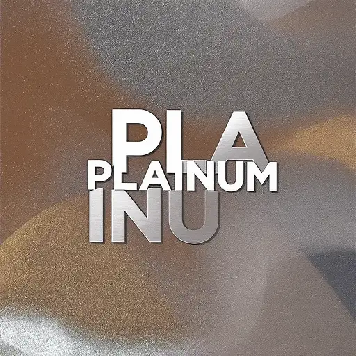
Create a high-end, modern logo for a design studio named “PLAinUM”. The logo should be sleek, minimalistic, and creative, with a premium aesthetic. Emphasize a strong visual hierarchy by highlighting “PLA” and “UM”, while keeping “in” subtle or seamlessly integrated. Use a refined sans-serif font with clean lines. Incorporate platinum-like metallic textures or soft gradients in silver, white, and light gray tones. The overall look should feel professional, innovative, and stylish — suitable for a cutting-edge design studio. The logo should be versatile and look great on both light and dark backgrounds. No icons, just a strong typographic identity
0
11
4 months ago
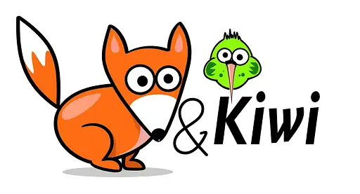
We are looking for a creative and experienced logo designer to redesign the logo of our children’s clothing brand Fuchs & Kiwi. The current logo has strong recognition, but we want to modernize its appearance while keeping its playful and approachable character. The new logo should: • Retain a high level of recognition (reference: current logo) • Look modern and sustainable, appealing to conscious consumers • Be child-friendly and warm, but not overly cartoonish • Spark curiosity and suggest that the brand offers more than meets the eye • Be scalable and versatile for online shop, clothing labels, packaging, etc. We are a well-known niche brand in the German market, currently expanding internationally. The visual identity needs to reflect trust, playfulness, and growth potential. About Fuchs & Kiwi Fuchs & Kiwi is a beloved children’s clothing brand from Germany with a strong niche following. Our collections are designed to be playful, practical, and sustainable, appealing to parents who value both aesthetics and ethical production. What sets us apart: • Values: We build trust through reliability, fair pricing, and innovation. Our work is defined by proactivity (zuvorkommend), high quality, and long-term partnerships with stakeholders. • Origin & Quality: While we have roots in German craftsmanship (“Made in Germany”), we are open to global growth and scalable production solutions – without compromising on core values. • Vision: We aim to reduce overhead and boost throughput via automation and a refined product range. The logo is part of a broader move toward modernizing our brand presence and reaching international markets. • Communication Style: We value clarity, empathy, and transparency. We see this project as a creative collaboration and appreciate partners who share a sense of ownership and joy in shaping a meaningful brand. Project Terms & Conditions By participating in this contest, all applicants agree to the following terms: 1. Ownership & Usage Rights • The winning submission becomes the exclusive property of Fuchs & Kiwi (represented by Max Witte). • The winner grants full, unlimited, and worldwide rights to use, modify, reproduce, and distribute the logo for any purpose (commercial or non-commercial), across all media and formats (digital, print, packaging, embroidery, etc.). • No royalties, future usage fees, or license restrictions will apply. • The winning designer agrees not to reuse or resell the logo or its components. 2. Originality • All submitted designs must be original work. No stock graphics, templates, or AI-generated content without proper licensing and disclosure. • Entries must not infringe on any copyrights, trademarks, or third-party rights. • By submitting a design, you confirm that you hold full rights to all components of the design. 3. Delivery Requirements • The winner must provide the final logo in the following formats: • Vector files: .AI, .EPS, and .PDF • Web files: .SVG, .PNG (transparent background), .JPG • Color variations: full color, black, white, inverted • Optional: favicon, brand icon, and mockups (shop, label, packaging) • All fonts used must be: • Free for commercial use, or • Delivered with a valid commercial license, or • Custom-drawn (with exclusive rights) 4. Timeline • Once a winner is selected, delivery of the final files must be completed within 7 calendar days, unless agreed otherwise. 5. Confidentiality & Exclusivity • All entries will be treated as confidential during the contest period. • The winning designer agrees to exclusive use of the design by Fuchs & Kiwi. • You may present the final work in your portfolio after public brand launch, with written approval. 6. Communication & Collaboration • We value respectful and open communication. If selected as a finalist, you may be asked for small refinements (e.g., spacing, font weight, color tuning). • Please respond within 48 hours if contacted during the decision period. 7. Guarantee & Final Payment • The contest is guaranteed: One winner will be selected, and the full prize will be paid. • No further compensation or claims can be made after full payment and delivery.
0
40
4 months ago
We are looking for a creative and experienced logo designer to redesign the logo of our children’s clothing brand Fuchs & Kiwi. The current logo has strong recognition, but we want to modernize its appearance while keeping its playful and approachable character. The new logo should: • Retain a high level of recognition (reference: current logo) • Look modern and sustainable, appealing to conscious consumers • Be child-friendly and warm, but not overly cartoonish • Spark curiosity and suggest that the brand offers more than meets the eye • Be scalable and versatile for online shop, clothing labels, packaging, etc. We are a well-known niche brand in the German market, currently expanding internationally. The visual identity needs to reflect trust, playfulness, and growth potential. About Fuchs & Kiwi Fuchs & Kiwi is a beloved children’s clothing brand from Germany with a strong niche following. Our collections are designed to be playful, practical, and sustainable, appealing to parents who value both aesthetics and ethical production. What sets us apart: • Values: We build trust through reliability, fair pricing, and innovation. Our work is defined by proactivity (zuvorkommend), high quality, and long-term partnerships with stakeholders. • Origin & Quality: While we have roots in German craftsmanship (“Made in Germany”), we are open to global growth and scalable production solutions – without compromising on core values. • Vision: We aim to reduce overhead and boost throughput via automation and a refined product range. The logo is part of a broader move toward modernizing our brand presence and reaching international markets. • Communication Style: We value clarity, empathy, and transparency. We see this project as a creative collaboration and appreciate partners who share a sense of ownership and joy in shaping a meaningful brand. Project Terms & Conditions By participating in this contest, all applicants agree to the following terms: 1. Ownership & Usage Rights • The winning submission becomes the exclusive property of Fuchs & Kiwi (represented by Max Witte). • The winner grants full, unlimited, and worldwide rights to use, modify, reproduce, and distribute the logo for any purpose (commercial or non-commercial), across all media and formats (digital, print, packaging, embroidery, etc.). • No royalties, future usage fees, or license restrictions will apply. • The winning designer agrees not to reuse or resell the logo or its components. 2. Originality • All submitted designs must be original work. No stock graphics, templates, or AI-generated content without proper licensing and disclosure. • Entries must not infringe on any copyrights, trademarks, or third-party rights. • By submitting a design, you confirm that you hold full rights to all components of the design. 3. Delivery Requirements • The winner must provide the final logo in the following formats: • Vector files: .AI, .EPS, and .PDF • Web files: .SVG, .PNG (transparent background), .JPG • Color variations: full color, black, white, inverted • Optional: favicon, brand icon, and mockups (shop, label, packaging) • All fonts used must be: • Free for commercial use, or • Delivered with a valid commercial license, or • Custom-drawn (with exclusive rights) 4. Timeline • Once a winner is selected, delivery of the final files must be completed within 7 calendar days, unless agreed otherwise. 5. Confidentiality & Exclusivity • All entries will be treated as confidential during the contest period. • The winning designer agrees to exclusive use of the design by Fuchs & Kiwi. • You may present the final work in your portfolio after public brand launch, with written approval. 6. Communication & Collaboration • We value respectful and open communication. If selected as a finalist, you may be asked for small refinements (e.g., spacing, font weight, color tuning). • Please respond within 48 hours if contacted during the decision period. 7. Guarantee & Final Payment • The contest is guaranteed: One winner will be selected, and the full prize will be paid. • No further compensation or claims can be made after full payment and delivery.
0
32
4 months ago
We are looking for a creative and experienced logo designer to redesign the logo of our children’s clothing brand Fuchs & Kiwi. The current logo has strong recognition, but we want to modernize its appearance while keeping its playful and approachable character. The new logo should: • Retain a high level of recognition (reference: current logo) • Look modern and sustainable, appealing to conscious consumers • Be child-friendly and warm, but not overly cartoonish • Spark curiosity and suggest that the brand offers more than meets the eye • Be scalable and versatile for online shop, clothing labels, packaging, etc. We are a well-known niche brand in the German market, currently expanding internationally. The visual identity needs to reflect trust, playfulness, and growth potential. About Fuchs & Kiwi Fuchs & Kiwi is a beloved children’s clothing brand from Germany with a strong niche following. Our collections are designed to be playful, practical, and sustainable, appealing to parents who value both aesthetics and ethical production. What sets us apart: • Values: We build trust through reliability, fair pricing, and innovation. Our work is defined by proactivity (zuvorkommend), high quality, and long-term partnerships with stakeholders. • Origin & Quality: While we have roots in German craftsmanship (“Made in Germany”), we are open to global growth and scalable production solutions – without compromising on core values. • Vision: We aim to reduce overhead and boost throughput via automation and a refined product range. The logo is part of a broader move toward modernizing our brand presence and reaching international markets. • Communication Style: We value clarity, empathy, and transparency. We see this project as a creative collaboration and appreciate partners who share a sense of ownership and joy in shaping a meaningful brand. Project Terms & Conditions By participating in this contest, all applicants agree to the following terms: 1. Ownership & Usage Rights • The winning submission becomes the exclusive property of Fuchs & Kiwi (represented by Max Witte). • The winner grants full, unlimited, and worldwide rights to use, modify, reproduce, and distribute the logo for any purpose (commercial or non-commercial), across all media and formats (digital, print, packaging, embroidery, etc.). • No royalties, future usage fees, or license restrictions will apply. • The winning designer agrees not to reuse or resell the logo or its components. 2. Originality • All submitted designs must be original work. No stock graphics, templates, or AI-generated content without proper licensing and disclosure. • Entries must not infringe on any copyrights, trademarks, or third-party rights. • By submitting a design, you confirm that you hold full rights to all components of the design. 3. Delivery Requirements • The winner must provide the final logo in the following formats: • Vector files: .AI, .EPS, and .PDF • Web files: .SVG, .PNG (transparent background), .JPG • Color variations: full color, black, white, inverted • Optional: favicon, brand icon, and mockups (shop, label, packaging) • All fonts used must be: • Free for commercial use, or • Delivered with a valid commercial license, or • Custom-drawn (with exclusive rights) 4. Timeline • Once a winner is selected, delivery of the final files must be completed within 7 calendar days, unless agreed otherwise. 5. Confidentiality & Exclusivity • All entries will be treated as confidential during the contest period. • The winning designer agrees to exclusive use of the design by Fuchs & Kiwi. • You may present the final work in your portfolio after public brand launch, with written approval. 6. Communication & Collaboration • We value respectful and open communication. If selected as a finalist, you may be asked for small refinements (e.g., spacing, font weight, color tuning). • Please respond within 48 hours if contacted during the decision period. 7. Guarantee & Final Payment • The contest is guaranteed: One winner will be selected, and the full prize will be paid. • No further compensation or claims can be made after full payment and delivery.
0
44

9 months ago
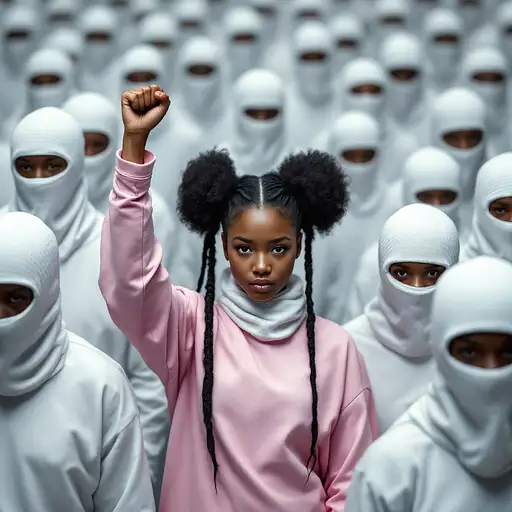
Generate a birds eyes perspective image. This image features a group of individuals dressed in identical white outfits with matching white, textured balaclavas covering their heads. They are standing in a uniform formation, creating a sense of conformity and uniformity. In contrast, one person in the center (30 years old african american girl with cornrow hair) stands out by wearing a pink outfit and she has a black cornrow and 2 buns. She raises her fist in the air. The image has a surreal, dystopian feel, with a strong visual impact due to the stark contrast between the black and white elements. The lighting appears soft and diffused, giving the scene an almost digital or hyperrealistic quality.
0
41

9 months ago
Generate a birds eyes perspective image. This image features a group of individuals dressed in identical white outfits with matching white, textured balaclavas covering their heads. They are standing in a uniform formation, creating a sense of conformity and uniformity. In contrast, one person in the center (30 years old african american girl with cornrow hair) stands out by wearing a pink outfit and she has a black cornrow and 2 buns. She raises her fist in the air. The image has a surreal, dystopian feel, with a strong visual impact due to the stark contrast between the black and white elements. The lighting appears soft and diffused, giving the scene an almost digital or hyperrealistic quality.
0
55

8 months ago
Create a sleek and modern minimalist logo for 'Abe Folcrá,' a DJ and music producer. The design should emphasize the unique accent in 'Folcrá,' making it a key visual element that adds character and distinction. The logo should embody the essence of house and disco music through clean, stylish typography and subtle geometric balance—without using obvious music-related illustrations like vinyl records or speakers. The overall feel should be professional, bold, and contemporary, with a refined aesthetic that stands out in the electronic music scene. Use the deep, sophisticated color #350343 as the primary tone, ensuring a strong and memorable brand identity. Consider negative space, letter spacing, or slight typographic modifications to enhance the logo’s uniqueness while maintaining a premium, timeless appeal
0
8

8 months ago
## Concept & Design Elements 1. **Overall Theme** - **Look & Feel**: Clean, modern, minimalistic - **Message**: You’re a strategic digital solutions partner offering user-centered innovation - **Color Palette**: A primary color that resonates with you (e.g. a deep teal or navy) plus a bright accent color (e.g. light aqua, coral, or lime). 2. **Background** - Use a **soft gradient** as the base: - For example: **Deep Navy (#0a2239)** fading into **Teal (#1e6f8c)** - Alternatively, a **clean white or very light gray** (#F5F5F5) background with subtle geometric shapes or line art in the corners. 3. **Visual/Graphic Motifs** - **Abstract Geometric Shapes**: Curved lines or subtle wave patterns that hint at “flow” (conveying agile solutions) - **Layered Overlays**: Transparent shapes at low opacity (e.g., 20% of your accent color) to add depth, plus angled lines suggesting forward momentum. - **Iconic Imagery**: A simplified wireframe globe or connected nodes to symbolize digital strategy. Keep it stylized and subtle, not overly busy. 4. **Text Placement & Styling** - **Your Name** (Large, clear font, e.g. Montserrat, Open Sans, or Lato) - A short tagline or brand statement, for instance: > *Digital Solutions & UX Strategist > Empowering Businesses Through User-Centered Innovation* - Keep the text to the left or center, leaving some negative space for a clean appearance. - Make sure fonts are big enough to be legible on multiple devices, especially mobile. 5. **Hierarchy & Balance** - **Name** or main title is the largest text element (e.g., 35–45 px in standard design software). - **Tagline** is smaller (around 20–25 px), italic or a lighter weight to differentiate it. - If desired, include bullet points or tiny icons (no more than 3) that represent key skills: - **UX Strategy** - **Business Transformation** - **Product Development** 6. **Brand Accent** - Use accent color behind a word or phrase in your tagline to draw the eye (e.g., “**Empowering** Businesses Through User-Centered Innovation”). - Consider a small stylized icon (like a light bulb or puzzle piece) near your name for a subtle brand mark. 7. **Exporting the Final Image** - **Aspect Ratio**: 16:9 - **Recommended Dimensions** (for clarity on various platforms): 1920 × 1080 px or 1600 × 900 px - **File Type**: PNG or JPEG for broad compatibility, with at least 72 DPI (consider 150 or 300 DPI if you want a crisp image where possible). --- ## Quick Step-by-Step (If You’re Using a Design Tool Like Canva, Figma, etc.) 1. **Create a 1920×1080 canvas** (16:9 ratio). 2. **Apply a gradient** background (e.g. deep navy to teal) or a light neutral background with abstract shapes. 3. **Add your name** in a prominent spot. 4. **Add a short tagline** underneath or to the side. 5. **Incorporate abstract or geometric elements** (lines, shapes, or icons) at low opacity. 6. **Position text** so it’s clearly visible and not obstructed by platform profile pictures (especially on LinkedIn). 7. **Export** as a high-quality PNG/JPEG. --- ## Example Text Layout (Minimal Option) +---------------------------------------------------------+ | [Soft Gradient Background / Abstract Shapes] | | | | [Your Name Here] | | Digital Solutions & UX Strategist | | Empowering Businesses Through User-Centered Innovation| | | | [Small icons or subtle shapes at bottom corners] | +---------------------------------------------------------+ - **Name** in a strong font (e.g., Montserrat Bold, 40px). - **Sub-text** (tagline) in a lighter weight or smaller size (24px). --- ### Final Tips - Keep the layout uncluttered; negative space is key to a professional vibe. - Test how the image crops on each platform (LinkedIn may place the user’s avatar over the left corner, etc.). - Make sure your accent color doesn’t clash with the text readability. - A short tagline is typically enough—avoid packing too much text into the banner. This design approach should give you a versatile **16:9** header image that visually communicates your new brand identity as a strategic, user-centered digital solutions professional. Feel free to adapt the color palette, shapes, and text style to best reflect your personality and goals.
0
29
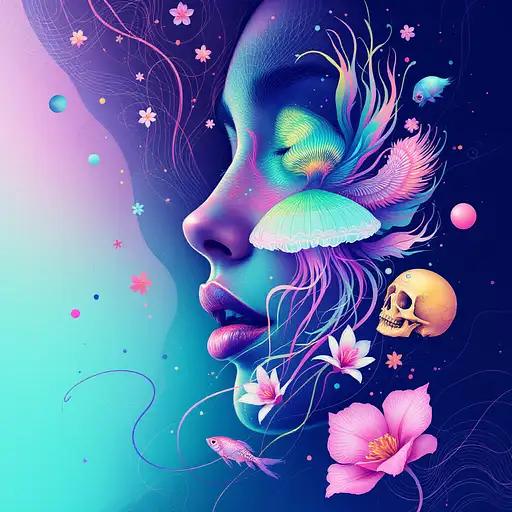
8 months ago
Goddess close-up portrait ribcagel. jellyfish phoenix head, nautilus, orchid, skull, betta fish, bioluminiscent cre## Concept & Design Elements 1. **Overall Theme** - **Look & Feel**: Clean, modern, minimalistic - **Message**: You’re a strategic digital solutions partner offering user-centered innovation - **Color Palette**: A primary color that resonates with you (e.g. a deep teal or navy) plus a bright accent color (e.g. light aqua, coral, or lime). 2. **Background** - Use a **soft gradient** as the base: - For example: **Deep Navy (#0a2239)** fading into **Teal (#1e6f8c)** - Alternatively, a **clean white or very light gray** (#F5F5F5) background with subtle geometric shapes or line art in the corners. 3. **Visual/Graphic Motifs** - **Abstract Geometric Shapes**: Curved lines or subtle wave patterns that hint at “flow” (conveying agile solutions) - **Layered Overlays**: Transparent shapes at low opacity (e.g., 20% of your accent color) to add depth, plus angled lines suggesting forward momentum. - **Iconic Imagery**: A simplified wireframe globe or connected nodes to symbolize digital strategy. Keep it stylized and subtle, not overly busy. 4. **Text Placement & Styling** - **Your Name** (Large, clear font, e.g. Montserrat, Open Sans, or Lato) - A short tagline or brand statement, for instance: > *Digital Solutions & UX Strategist > Empowering Businesses Through User-Centered Innovation* - Keep the text to the left or center, leaving some negative space for a clean appearance. - Make sure fonts are big enough to be legible on multiple devices, especially mobile. 5. **Hierarchy & Balance** - **Name** or main title is the largest text element (e.g., 35–45 px in standard design software). - **Tagline** is smaller (around 20–25 px), italic or a lighter weight to differentiate it. - If desired, include bullet points or tiny icons (no more than 3) that represent key skills: - **UX Strategy** - **Business Transformation** - **Product Development** 6. **Brand Accent** - Use accent color behind a word or phrase in your tagline to draw the eye (e.g., “**Empowering** Businesses Through User-Centered Innovation”). - Consider a small stylized icon (like a light bulb or puzzle piece) near your name for a subtle brand mark. 7. **Exporting the Final Image** - **Aspect Ratio**: 16:9 - **Recommended Dimensions** (for clarity on various platforms): 1920 × 1080 px or 1600 × 900 px - **File Type**: PNG or JPEG for broad compatibility, with at least 72 DPI (consider 150 or 300 DPI if you want a crisp image where possible). --- ## Quick Step-by-Step (If You’re Using a Design Tool Like Canva, Figma, etc.) 1. **Create a 1920×1080 canvas** (16:9 ratio). 2. **Apply a gradient** background (e.g. deep navy to teal) or a light neutral background with abstract shapes. 3. **Add your name** in a prominent spot. 4. **Add a short tagline** underneath or to the side. 5. **Incorporate abstract or geometric elements** (lines, shapes, or icons) at low opacity. 6. **Position text** so it’s clearly visible and not obstructed by platform profile pictures (especially on LinkedIn). 7. **Export** as a high-quality PNG/JPEG. --- ## Example Text Layout (Minimal Option) +---------------------------------------------------------+ | [Soft Gradient Background / Abstract Shapes] | | | | [Your Name Here] | | Digital Solutions & UX Strategist | | Empowering Businesses Through User-Centered Innovation| | | | [Small icons or subtle shapes at bottom corners] | +---------------------------------------------------------+ - **Name** in a strong font (e.g., Montserrat Bold, 40px). - **Sub-text** (tagline) in a lighter weight or smaller size (24px). --- ### Final Tips - Keep the layout uncluttered; negative space is key to a professional vibe. - Test how the image crops on each platform (LinkedIn may place the user’s avatar over the left corner, etc.). - Make sure your accent color doesn’t clash with the text readability. - A short tagline is typically enough—avoid packing too much text into the banner. This design approach should give you a versatile **16:9** header image that visually communicates your new brand identity as a strategic, user-centered digital solutions professional. Feel free to adapt the color palette, shapes, and text style to best reflect your personality and goals.atures, intricate artwork . octane render, trending on artstation,t symmetrical artwork. cinematic, hyper realism, high detail, octane render, 8k
0
61

8 months ago
## Concept & Design Elements 1. **Overall Theme** - **Look & Feel**: Clean, modern, minimalistic - **Message**: You’re a strategic digital solutions partner offering user-centered innovation - **Color Palette**: A primary color that resonates with you (e.g. a deep teal or navy) plus a bright accent color (e.g. light aqua, coral, or lime). 2. **Background** - Use a **soft gradient** as the base: - For example: **Deep Navy (#0a2239)** fading into **Teal (#1e6f8c)** - Alternatively, a **clean white or very light gray** (#F5F5F5) background with subtle geometric shapes or line art in the corners. 3. **Visual/Graphic Motifs** - **Abstract Geometric Shapes**: Curved lines or subtle wave patterns that hint at “flow” (conveying agile solutions) - **Layered Overlays**: Transparent shapes at low opacity (e.g., 20% of your accent color) to add depth, plus angled lines suggesting forward momentum. - **Iconic Imagery**: A simplified wireframe globe or connected nodes to symbolize digital strategy. Keep it stylized and subtle, not overly busy. 4. **Text Placement & Styling** - **Your Name** (Large, clear font, e.g. Montserrat, Open Sans, or Lato) - A short tagline or brand statement, for instance: > *Digital Solutions & UX Strategist > Empowering Businesses Through User-Centered Innovation* - Keep the text to the left or center, leaving some negative space for a clean appearance. - Make sure fonts are big enough to be legible on multiple devices, especially mobile. 5. **Hierarchy & Balance** - **Name** or main title is the largest text element (e.g., 35–45 px in standard design software). - **Tagline** is smaller (around 20–25 px), italic or a lighter weight to differentiate it. - If desired, include bullet points or tiny icons (no more than 3) that represent key skills: - **UX Strategy** - **Business Transformation** - **Product Development** 6. **Brand Accent** - Use accent color behind a word or phrase in your tagline to draw the eye (e.g., “**Empowering** Businesses Through User-Centered Innovation”). - Consider a small stylized icon (like a light bulb or puzzle piece) near your name for a subtle brand mark. 7. **Exporting the Final Image** - **Aspect Ratio**: 16:9 - **Recommended Dimensions** (for clarity on various platforms): 1920 × 1080 px or 1600 × 900 px - **File Type**: PNG or JPEG for broad compatibility, with at least 72 DPI (consider 150 or 300 DPI if you want a crisp image where possible). --- ## Quick Step-by-Step (If You’re Using a Design Tool Like Canva, Figma, etc.) 1. **Create a 1920×1080 canvas** (16:9 ratio). 2. **Apply a gradient** background (e.g. deep navy to teal) or a light neutral background with abstract shapes. 3. **Add your name** in a prominent spot. 4. **Add a short tagline** underneath or to the side. 5. **Incorporate abstract or geometric elements** (lines, shapes, or icons) at low opacity. 6. **Position text** so it’s clearly visible and not obstructed by platform profile pictures (especially on LinkedIn). 7. **Export** as a high-quality PNG/JPEG. --- ## Example Text Layout (Minimal Option) +---------------------------------------------------------+ | [Soft Gradient Background / Abstract Shapes] | | | | [Your Name Here] | | Digital Solutions & UX Strategist | | Empowering Businesses Through User-Centered Innovation| | | | [Small icons or subtle shapes at bottom corners] | +---------------------------------------------------------+ - **Name** in a strong font (e.g., Montserrat Bold, 40px). - **Sub-text** (tagline) in a lighter weight or smaller size (24px). --- ### Final Tips - Keep the layout uncluttered; negative space is key to a professional vibe. - Test how the image crops on each platform (LinkedIn may place the user’s avatar over the left corner, etc.). - Make sure your accent color doesn’t clash with the text readability. - A short tagline is typically enough—avoid packing too much text into the banner. This design approach should give you a versatile **16:9** header image that visually communicates your new brand identity as a strategic, user-centered digital solutions professional. Feel free to adapt the color palette, shapes, and text style to best reflect your personality and goals.
0
43

7 months ago
This surreal and visually disorienting portrait is tightly framed in a vertical format, showing a distorted cluster of human faces and partial torsos seemingly fused together and sprawled across a textured cobblestone surface in an outdoor setting. Captured from a slight top-down angle at close range, the image exaggerates facial proportions and anatomy using digital manipulation or AI rendering, with hyperreal textures and an uncanny sense of motion freeze. The figures appear to be in a crawling position with various expressions—smiling, neutral, or twisted—facing outward and upward, creating a chaotic yet oddly unified composition. Clothing is minimal and largely obscured, though hints of neutral-toned fabric and skin are visible, blending with the warped forms. The setting is sunlit with crisp shadows falling diagonally across the ground, suggesting mid-morning or afternoon light with high contrast and strong directional intensity. The color palette is dominated by warm skin tones, cool shadows, and muted grays from the ground, enhanced by the sheen of moist or plasticky skin textures that amplify the eerie effect. The depth of field is shallow, keeping all elements in sharp, almost exaggerated focus, which enhances the surreal and unnatural visual weight. The overall vibe is unsettling, bordering on grotesque, with a hyperreal-meets-nightmarish aesthetic, likely suited for experimental digital art platforms, conceptual photography exhibits, or commentary on identity and form in post-human visual narratives. The focal point is the largest and most clearly smiling face at the bottom center, drawing attention through contrast and relative clarity amidst the distortion, while the surface textures of both skin and stone contribute to the tactile intensity of the image.
0
45
6 months ago
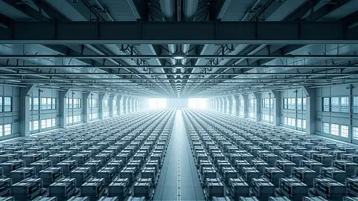
A large-scale, hyper-detailed image of a modern industrial interior or urban landscape, viewed from an elevated, distant perspective. The scene is devoid of people and composed with strict symmetry and repetition. Surfaces are clean and flat, emphasizing geometric patterns and a sense of overwhelming order. Cool, neutral tones dominate the imageâsteel grey, glassy whites, muted blues. Rows of identical objects (e.g., storage shelves, windows, seats, shipping containers) create a rhythmic, almost abstract structure across the entire frame. The atmosphere is sterile, detached, and monumental, evoking feelings of control, isolation, and visual abstraction. Ultra high-resolution, minimal noise, strong linear perspective, architectural clarity.âââ
0
22
7 months ago
**Costume and Appearance:** - **Outfit:** The superhero's costume is sleek and form-fitting, designed to allow for maximum agility while highlighting her confident curves. It may be a vibrant color, such as deep red or royal blue, adorned with intricate patterns or symbols that reflect her cultural heritage. The material could appear both tactical and stylish, balancing functionality and aesthetics. - **Boots:** She wears stylish yet practical boots that are knee-high, providing both mobility and a touch of flair. - **Accessories:** To enhance her superhero persona, she could wear a belt with gadgets or tools that aid her in her missions, and perhaps a cape or a stylish jacket that billows dramatically as she moves. She might also have a headpiece or mask that adds mystery while showcasing her captivating eyes. - **Hair:** Her hair is long, flowing, and well-styled, possibly featuring a striking color or highlights that add to her unique look. It could be tied back in a practical way for action or left loose for style. - **Makeup:** She may wear bold makeup that enhances her features, showcasing her confidence, with an emphasis on her eyes and a daring lip color, encapsulating her fierce personality. **Physical Attributes:** - **Build:** She has a strong, athletic build that shows off her capabilities and years of training. Her posture is confident and commanding, reflecting her strength and experience. - **Facial Features:** She possesses soft, yet striking, facial features with high cheekbones, expressive eyes, and a warm smile that can be both inviting and intimidating. **Personality Traits:** - **Empowered and Confident:** This character exudes confidence, embodying the strength and wisdom that come with experience. She balances her superhero duties with her role as a mother, often showcasing the duality of her life. - **Witty and Charismatic:** Her personality may be characterized by sharp wit and charisma, allowing her to engage with both allies and adversaries effectively. She draws people to her, inspiring those around her. - **Caring Yet Fierce:** While she is nurturing and deeply cares for her family and community, she is also fiercely protective and ready to take action when needed, embodying a true superhero's spirit. This character would not only be visually striking but also layered with depth, showcasing the strength and multifaceted nature of motherhood intertwined with her superhero identity.
0
26
8 months ago
Create a masterful double exposure oil painting that seamlessly blends the powerful and raw spirit of Rocky Balboa with the grit of the urban landscape. This painting should depict Rocky’s iconic figure in a way that fuses his inner strength, determination, and struggle with the world around him—transforming his character into a symbol of resilience, heart, and triumph. In the foreground, Rocky’s muscular silhouette should dominate the canvas, painted with strong, bold strokes that evoke both movement and resolve. His stance should be poised mid-action—perhaps capturing a moment of intense training or the famous stance of raising his fists in victory atop the steps of the Philadelphia Museum of Art. His features should be captured in vivid detail, emphasizing his facial expressions that mix determination with vulnerability. The double exposure effect should integrate an urban backdrop within Rocky’s form. His figure could be overlaid with elements of the city—gritty, dark streets of Philadelphia, alleyways lit by streetlights, the silhouettes of crumbling brick buildings, and the hard, unforgiving concrete of the urban landscape. These elements should weave in and out of his form, blending together through overlapping layers of paint to create a visual metaphor for his journey—a reflection of how the city’s harshness and his relentless drive are inseparable. The cityscape could be infused with dynamic movement and texture—depicting the gritty energy of his environment. The use of dark shades like deep blues, grays, and blacks should contrast with the warmer tones of Rocky’s form—his flesh tones and the glow of street lamps reflecting determination and hope in the midst of struggle. Rocky’s body could almost seem to be emerging from or merging with the buildings, as if his strength is both shaped and fueled by the city around him. The color palette should emphasize contrast—heavy use of dark, muted hues for the city and surrounding environment, while Rocky’s figure can be painted with more vivid, dynamic colors. Rich oranges, reds, and yellows might be used to highlight his energy and determination, especially where the light of a streetlamp or the reflection of the sun hits his face or body. These bright hues should symbolize his resilience, while the darker tones represent the challenges he faces. Incorporate subtle details that nod to iconic scenes from the film—perhaps the shadow of a punching bag, the distant shape of a gym, or faint traces of Rocky’s training equipment overlaid within the composition. These references should feel integrated into the double exposure as a part of his identity, blending with his form, highlighting his journey from underdog to champion. The double exposure technique should not just be a visual gimmick, but a narrative tool—showing the physical and emotional layers of Rocky’s character, both the raw toughness and the inner fragility, the battle within and the world he struggles to conquer. This painting should capture his essence as both a symbol of perseverance and the embodiment of the human spirit’s ability to rise against all odds. Create a compelling double exposure oil painting that captures the ominous presence of the great white shark from Jaws while symbolizing the tension, fear, and raw power of the ocean. The painting should evoke both the terror of the shark and the vulnerability of those who encounter it, seamlessly blending the natural world with the looming menace that it represents. In the foreground, the figure of the shark should emerge in dynamic, fluid strokes, its sleek, menacing form towering over the ocean waves. The shark’s details—its gaping mouth, rows of sharp teeth, and dark, cold eyes—should be painted with intense precision, capturing the moment of its predatory instinct. Its massive, sinuous body should dominate the composition, a shadow of terror that contrasts against the backdrop of the sea. The double exposure effect should allow the ocean itself to blend into the shark’s form, illustrating the profound relationship between the creature and its environment. Swirling, turbulent waves, deep blues, and blacks of the water should blend into the shark’s body, as though the shark is part of the sea, emerging from it and vanishing into it simultaneously. Use the brushstrokes to create movement within the water—curving lines of foam, crashing waves, and undercurrents that suggest the danger lurking beneath the surface. In the background, the faint outline of the beach, a small boat, or the silhouettes of the characters from the film, like Chief Brody or Quint, could be subtly incorporated within the double exposure, their forms almost indistinguishable from the ocean or sky. This technique should emphasize the scale of the shark compared to the human figures, highlighting the helplessness and fear they experience when facing such a formidable foe. The colors should be a striking contrast between the cold, dark blues and blacks of the ocean depths and the sharp whites and grays of the shark, with occasional touches of deep crimson around its jaws, suggesting the violence of the attack. The sky above could have stormy, ominous clouds, painted in various shades of gray and muted oranges to reflect the tension and impending doom, as though the world itself is holding its breath. The double exposure technique should also integrate the idea of impending danger—the gradual fading of light or shadow around the edges of the shark, emphasizing the idea that the predator is always lurking just out of sight. A subtle play of light and dark should create a haunting atmosphere, giving the viewer the sense that the shark is not just a physical threat, but a symbol of primal fear, the unknowable forces of nature, and the dark mysteries that lie beneath the surface. This painting should evoke both the majesty and terror of Jaws, using the double exposure technique to weave together the natural world and the horror of the shark into one cohesive, unforgettable image. The result should be a masterpiece that taps into universal fears—of the unknown, of power, and of nature’s ability to both captivate and destroy.
0
23
8 months ago
Create a masterful double exposure oil painting that seamlessly blends the powerful and raw spirit of Rocky Balboa with the grit of the urban landscape. This painting should depict Rocky’s iconic figure in a way that fuses his inner strength, determination, and struggle with the world around him—transforming his character into a symbol of resilience, heart, and triumph. In the foreground, Rocky’s muscular silhouette should dominate the canvas, painted with strong, bold strokes that evoke both movement and resolve. His stance should be poised mid-action—perhaps capturing a moment of intense training or the famous stance of raising his fists in victory atop the steps of the Philadelphia Museum of Art. His features should be captured in vivid detail, emphasizing his facial expressions that mix determination with vulnerability. The double exposure effect should integrate an urban backdrop within Rocky’s form. His figure could be overlaid with elements of the city—gritty, dark streets of Philadelphia, alleyways lit by streetlights, the silhouettes of crumbling brick buildings, and the hard, unforgiving concrete of the urban landscape. These elements should weave in and out of his form, blending together through overlapping layers of paint to create a visual metaphor for his journey—a reflection of how the city’s harshness and his relentless drive are inseparable. The cityscape could be infused with dynamic movement and texture—depicting the gritty energy of his environment. The use of dark shades like deep blues, grays, and blacks should contrast with the warmer tones of Rocky’s form—his flesh tones and the glow of street lamps reflecting determination and hope in the midst of struggle. Rocky’s body could almost seem to be emerging from or merging with the buildings, as if his strength is both shaped and fueled by the city around him. The color palette should emphasize contrast—heavy use of dark, muted hues for the city and surrounding environment, while Rocky’s figure can be painted with more vivid, dynamic colors. Rich oranges, reds, and yellows might be used to highlight his energy and determination, especially where the light of a streetlamp or the reflection of the sun hits his face or body. These bright hues should symbolize his resilience, while the darker tones represent the challenges he faces. Incorporate subtle details that nod to iconic scenes from the film—perhaps the shadow of a punching bag, the distant shape of a gym, or faint traces of Rocky’s training equipment overlaid within the composition. These references should feel integrated into the double exposure as a part of his identity, blending with his form, highlighting his journey from underdog to champion. The double exposure technique should not just be a visual gimmick, but a narrative tool—showing the physical and emotional layers of Rocky’s character, both the raw toughness and the inner fragility, the battle within and the world he struggles to conquer. This painting should capture his essence as both a symbol of perseverance and the embodiment of the human spirit’s ability to rise against all odds. This oil painting should be bold, intense, and deeply emotional—evoking the passion and tenacity of Rocky’s character, while also exploring the complex relationship between an individual and their environment, the fight against adversity, and the pursuit of greatness
0
18

17 days ago
1. Trône sur les Ruines (Final, Approved Prompt) Ultra-detailed cinematic concept art of a Moroccan man in his late 20s, no beard, clean-shaven face with a medium taper fade and short buzz cut on top, sitting powerfully on a brutalist throne. His skin is naturally light-brown Moroccan tone. His eyes are locked onto the viewer — serious, proud, full of rage and painful wisdom. His expression speaks of a man who’s seen war, betrayal, and loss — but wears it like armor. He looks like the last survivor turned king. The throne is not traditional — it’s forged from broken concrete blocks, rusted rebar sticking out at odd angles, scorched books, shattered satellite dishes, and melted tech — like a symbolic fusion of lost knowledge, rebellion, and destruction. Cracks run through the base of the throne like veins. His outfit is inspired by a mix of street-royalty and Napoleonic grandeur: a long dark armored trench coat stitched from military-grade fabric with faded gold zellige embroidery across the seams and sleeves. Underneath, he wears a cracked bulletproof vest over a high-neck urban tunic. Armored matte black pants with subtle Moroccan motifs and sharp metal straps. Heavy military boots scratched and dust-worn. A torn deep red cloak falls over one shoulder like a fallen flag. A bent metallic green star medal is pinned to his chest — legacy over luxury. His fingers wear multiple chipped iron rings. No vanity. Only survival. On his head, a fractured, irregular gold-and-iron crown, forged from wreckage and ruin, sharp-edged and burned. The crown leans slightly — a symbol of earned rule, not divine right. Background: A devastated Moroccan city, partly resembling Casablanca. Burnt satellite dishes, broken towers, and fragments of modern life crumbled to dust. A half-burnt Moroccan flag waves behind him, attached to a broken building. Storm clouds weigh heavy above, ash floating, but golden-orange light cracks through the sky, signaling hope. Typography: “Trône sur les Ruines” in cracked metallic gold serif font, bold but weathered. Clean placement in bottom right or top left. Regal but damaged. Optional glow or slight emboss. Color Palette: ash grey, coal black, storm blue, bronze gold, Moroccan red, dusk orange. Mood: Power earned through pain. Cinematic, poetic, violent, beautiful. Style: Hyper-realistic, cinematic poster quality, dramatic shadows, inspired by Yeezus, The Blueprint, LiveLoveA$AP, and modern war films. 2. Profile Portrait Version (for Artist Identity) Ultra-realistic cinematic portrait of a Moroccan man in his late 20s with no beard, clean-shaven jawline, and a medium taper fade with short buzz cut. Skin tone: light brown, Moroccan/North African complexion. He wears a fitted street-style bomber jacket with gold trimming and minimal zellige embroidery at the collar. A faint golden crown rests slightly tilted on his head — broken at one edge, yet strong. His expression is direct, sharp, and serious — a mix of defiance and melancholy. The background is soft focus, ruined concrete and graffiti, hints of smoke and ambient golden light. Dust or ash particles drift mid-air for a cinematic atmosphere. Mood: Heroic, street royalty, solitary focus. Power in silence. Style: Poster-grade realism. Framed chest-up shot for profile use. 3. Poster Version (Based on Throne Prompt, Full Figure) Same character and setting as Trône sur les Ruines, but the full body is shown. The man sits in a wide, weathered throne made of fractured concrete, old TVs, rusted weapons, and bent steel. His feet rest firmly on a cracked marble step, golden light brushing against his boots. His posture is heavy yet composed, elbows on the throne, hands gripping the stone arms. Behind him: skeletal ruins of a city skyline, broken antennas, faded graffiti, distant firelight. Torn flags ripple faintly in the back. Color tones: Bronze smoke, ash blue, scorched red, urban grey, golden dusk. Typography: Optional vertical metallic serif font to the left: “Drb-G Flow | Trône sur les Ruines” — minimal, bold, cinematic. Mood: Cinematic and mythic — the legend who came from nothing. 4. L’Hustle w’Loyalty (Casablanca Street Edition) Cinematic 8K night-time concept art for the Moroccan rap album L’Hustle w’Loyalty by Drb-G Flow. A powerful, hyper-realistic urban portrait of strength, loyalty, and solitude — a visual hymn to the Moroccan hustle spirit. The artist stands as the hero subject in the center of a damp Casablanca street at night. His full figure is visible, perfectly framed and illuminated by a mix of warm sodium streetlights and cool neon reflections. He wears modern Moroccan streetwear: a black tactical jacket layered over dark cargo pants, subtle gold jewelry glinting faintly under the city glow. His face is half-shadowed — expression serious, proud, and pained. A man hardened by loyalty and the street code. Setting & Composition: Wet asphalt stretches beneath his boots, reflecting light pools from the city around him. Smoke drifts lazily through the air, diffusing the orange and blue tones of the night. Buildings rise on both sides — textured walls, Arabic signage, soft neon. The perspective leads directly toward him, perfect axial symmetry, giving him the aura of both leader and ghost of the streets. No clutter, no distractions — just the man and his city. Lighting: Cinematic realism. Warm low-angle key from the left, cool bounce from signage, soft halo backlight through smoke. The balance between shadow and glow captures the weight of urban solitude. Reflections on the ground and jewelry shimmer naturally — never polished, always raw. Atmosphere: Humid air thick with haze and faint exhaust smoke. Street silent, as if time has frozen. The world feels post-rain — damp, reflective, honest. A halo of vapor and city light turns the mundane into mythic. Typography: L’Hustle w’Loyalty in tall serif metallic gold, balanced between royal and modern. Placement top center or bottom right, minimal but powerful. Sub-text: Drb-G Flow in refined sans-serif, matching the gold tone. Color Palette: Ash grey, black asphalt, gold reflections, muted cyan glows, warm Moroccan amber, and soft night blues. Contrast ratio cinematic (1:3) — the light breathes through shadow. Mood: Loyalty. Power. Survival. The calm before the next move. Cinematic and poetic — like Drive meets Casablanca, with the realism of City of God and the solitude of The Batman. Style: Hyper-realistic, cinematic photography direction, rectilinear lens perspective (35 mm). Film-grade depth, sharp texture, and natural color physics — built for album cover use and high-end poster print.
0
15

14 days ago
Logo Design Brief Logo Design Brief Intelligent Context AI Date: October 24, 2025 Project: Corporate Identity & Logo Design Company: Intelligent Context AI 1. Company Overview Intelligent Context AI is the enterprise technology company behind Mivante, a Universal Enterprise Intelligence Platform that transforms workplace communication into quantifiable business capabilities. We solve the fundamental "organizational context problem" - enterprises typically capture only 15-20% of institutional knowledge and lose 80-85% when employees leave. Our patent-protected technology creates persistent institutional memory that compounds competitive advantage over time, fundamentally differentiating us from stateless AI assistants. We're building the infrastructure layer for enterprise intelligence. Mission To make every enterprise conversation, relationship, and interaction intelligently retrievable, actionable, and valuable - creating institutional memory that grows smarter over time. Vision To become the "AWS of Communication Intelligence" - the essential infrastructure layer that powers how organizations capture, understand, and leverage their collective knowledge. 2. Brand Positioning Core Value Proposition Simple surface, sophisticated depth: The solution appears obvious while masking 90% of technical complexity Institutional memory that compounds: Unlike point-in-time tools, our platform creates permanent competitive advantage Persistent context, not stateless responses: We remember everything; traditional AI forgets everything Market Position Enterprise B2B SaaS targeting organizations with 500+ knowledge workers Premium positioning: $150K average contract values Technical sophistication with executive accessibility Platform play with ecosystem ambitions Brand Personality Intelligent: Sophisticated, data-driven, technically credible Contextual: Understanding relationships, connections, nuance Trustworthy: Enterprise-grade security, reliability, permanence Forward-thinking: Innovation without being flashy or trendy Professional: Serious business impact, not consumer whimsy 3. Target Audience Primary Audiences Enterprise CIOs/CTOs: Technical decision-makers evaluating infrastructure investments CEOs/COOs: Business leaders seeking competitive advantage and operational efficiency Enterprise Architects: Professionals assessing integration complexity and scalability HR/People Operations: Leaders addressing employee engagement and retention Secondary Audiences Technology Partners (Microsoft, Google, Salesforce ecosystem) Strategic Investors (Enterprise SaaS, AI/ML focus) Implementation Partners and System Integrators Industry Analysts and Press What They Value Technical credibility and architectural sophistication ROI clarity and measurable business outcomes Enterprise-grade security and compliance Long-term strategic value, not tactical point solutions Integration with existing technology investments 4. Design Direction & Inspiration Conceptual Themes Primary Concept: Layered Intelligence The logo should communicate the idea of multiple layers of understanding building on each other - context building upon context, creating depth and institutional memory over time. Visual Metaphors to Explore: Geological strata: Layers that persist and accumulate over time Neural connections: Intelligence emerging from interconnected relationships Light refracting through layers: Context revealing deeper meaning Architectural blueprints: Foundation for building something larger Memory formations: Information organizing into retrievable patterns Secondary Concept: Connected Context Relationships between data points, people, and ideas - the network effect of understanding. Visual Metaphors to Explore: Graph networks: Nodes and edges representing relationships Constellation mapping: Individual points forming meaningful patterns Synaptic connections: Intelligent linking creating emergent value Woven fabric: Individual threads creating stronger whole Tertiary Concept: Temporal Persistence Unlike ephemeral AI responses, our platform creates permanent, compounding value. Visual Metaphors to Explore: Growth rings: Time-based accumulation Compound interest visualization: Value building on itself Sedimentary layers: Permanent record formation Infinite loop/Möbius: Continuous, self-reinforcing cycle 5. Key Concepts to Communicate Must Communicate Intelligence: This is an AI/ML company with technical sophistication Context: Understanding relationships, connections, and deeper meaning Enterprise credibility: Serious business tool, not consumer app Permanence/Persistence: Unlike stateless tools, we create lasting value Nice to Communicate Innovation and forward-thinking Simplicity masking complexity Network effects and interconnection Trust and reliability Scalability and architecture Must NOT Communicate Consumer app aesthetics Trendy/flashy startup vibes Generic "AI" clichés (brain icons, circuit boards) Complexity without sophistication Cold, impersonal technology 6. Style Preferences Visual Style Modern but timeless: Not chasing current trends, built to last Geometric precision: Clean lines, mathematical relationships Depth through simplicity: Sophisticated ideas expressed clearly Dimensional thinking: Suggest layers, depth, or perspective without clutter Typography Considerations Sans-serif preferred: Modern, clean, professional Medium weight: Authority without aggression Excellent readability: Must work at all sizes from business card to billboard Subtle distinction: Slightly modified letterforms acceptable if they add meaning Color Direction We're open to exploration, but initial thinking: Primary Palette Ideas: Deep Blues: Trust, intelligence, enterprise credibility (avoid generic "tech blue") Deep Purples/Indigos: Innovation, wisdom, sophistication Slate/Charcoal: Permanence, stability, foundation Accent consideration: Subtle warm accent for approachability Color Psychology Goals: Trustworthy and reliable Intelligent and sophisticated Professional but not cold Distinctive without being loud Avoid: Bright, saturated "startup" colors Generic tech blues without distinction Pastels or overly soft palettes Black/white only (needs some color for differentiation) 7. Technical Requirements Versatility Scalability: Must work from 16px favicon to large format Monochrome versions: Strong recognition in single color (black, white, grayscale) Responsive adaptations: Consider simplified versions for small applications Background flexibility: Works on white, dark, and colored backgrounds Applications Digital: Website, app icons, email signatures, presentations Print: Business cards, letterhead, reports, trade show materials Social: LinkedIn, Twitter, profile images (square crops) Motion: Potential for simple animations (not required in initial phase) File Deliverables Vector files (AI, EPS, SVG) High-res rasters (PNG with transparency) Color, grayscale, and black/white versions Minimum size guidelines Clear space requirements Brand usage guidelines 8. Competitive Context Differentiation Needs Our logo should stand apart from: Generic AI/ML Companies: Avoid: Brain illustrations, neural network diagrams, circuit boards Instead: More abstract, architectural, institutional Enterprise Software Companies: Avoid: Sterile, overly corporate, forgettable Instead: Memorable, intelligent, with distinct personality Communication Platforms: Avoid: Speech bubbles, messaging icons, social media aesthetics Instead: Deeper meaning, infrastructure, intelligence layer Companies to Study (for differentiation, not imitation) Palantir: Sophisticated, serious, slightly mysterious Databricks: Clean geometry, data-focused, approachable Stripe: Simple but distinctive, modern sophistication Cloudflare: Network thinking, infrastructure layer Notion: Simple but expressive, tool that grows with you 9. What to Avoid Conceptual Avoid List Generic "AI" clichés (brains, robots, circuit boards) Overly literal interpretations (speech bubbles for communication) Trendy effects that will date quickly (gradients, glass morphism) Complexity that doesn't add meaning Looking like a consumer app or consumer AI assistant Stylistic Avoid List Hand-drawn or organic styles Playful or whimsical approaches Overly aggressive or sharp aesthetics Feminine or masculine extremes Abstract art that's too ambiguous 10. Success Criteria A Successful Logo Will: Command respect in enterprise boardrooms and technical architecture reviews Remain memorable after a single PowerPoint presentation Scale perfectly from tiny favicon to large-format banner Tell a story about context, intelligence, and institutional memory Age gracefully looking fresh in 5-10 years Differentiate clearly from generic AI/SaaS competitors Support the brand narrative of "simple surface, sophisticated depth" Enable expansion as the company grows and evolves Key Questions the Logo Should Answer: "What does this company do?" → Something intelligent with data/context "Who is this for?" → Serious enterprise customers "Can I trust them?" → Yes, they're sophisticated and credible "Are they innovative?" → Yes, but not in a gimmicky way 11. Project Timeline & Process Preferred Approach Concept exploration: 3-5 distinct conceptual directions with rationale Refinement: 2 strongest concepts developed further Finalization: Single direction refined to perfection Application examples: See logo across various contexts Collaboration Style We value: Strategic thinking: Understanding the "why" behind design decisions Clear communication: Articulating choices and rationale Iteration: Refining toward excellence, not settling for first good idea Systems thinking: How logo works within larger brand ecosystem 12. Additional Context Brand Name Considerations "Intelligent Context AI" breaks down as: Intelligent: Core capability, AI/ML foundation Context: Differentiator, our unique value AI: Category identifier, market clarity The logo can work with: Full name: "Intelligent Context AI" Abbreviated: "IC AI" or "ICAI" Standalone mark without text (once brand is established) Platform Name Integration Our flagship product is Mivante - the logo system should allow for clear hierarchy: Company: Intelligent Context AI Product: Mivante (powered by Intelligent Context AI) Consider how these two brand elements work together without confusion. 13. Inspiration References Abstract Concepts Topographic maps showing layered elevation Sedimentary rock formations showing time and depth Network topology diagrams showing interconnections Memory palace concept from classical rhetoric Library card catalog systems (organizing knowledge) Visual References Isometric architectural drawings Data visualization aesthetics (Edward Tufte) Minimal, geometric abstractions Swiss design principles Bauhaus form-follows-function philosophy 14. Questions for Designer How do you approach balancing sophistication with accessibility? What's your process for ensuring a logo ages well vs. chasing trends? How do you think about representing abstract concepts like "context" visually? What examples from your portfolio show enterprise B2B brand work? How do you handle the challenge of standing out in a crowded AI/ML space? Contact & Next Steps Project Lead: Ash (Founder, Intelligent Context AI) We're excited to see thoughtful, strategic approaches that understand both the technical sophistication of our platform and the enterprise market we serve. The best designs will tell a compelling story about institutional memory, contextual intelligence, and permanent competitive advantage. This brief represents our current thinking and we welcome designer insights that might challenge or expand these directions. Strong rationale can override any guideline presented here. Logo Text Intelligent Context AI
0
10

5 months ago
Ultra-high-resolution, hyper-realistic, professional color photographic portrait of physicist Robert Andrews Millikan. The image MUST perfectly and precisely replicate his distinct facial features, characteristic expression, head posture, and overall iconic likeness, drawing inspiration from various authoritative reference images of Robert Andrews Millikan. The focus is a tightly cropped head-and-shoulders shot. Overall Photographic Style: A definitive early 20th-century formal studio portrait, executed with absolute fidelity and timeless elegance. The image exhibits extreme clarity, pixel-perfect sharpness, and intricate micro-detail across all elements. It appears as if captured by a master portrait photographer using a cutting-edge large-format digital camera (e.g., Phase One XF IQ4 150MP, Hasselblad H6D-400c MS) with an uncompromised, razor-sharp prime portrait lens (e.g., Schneider Kreuznach 110mm LS f/2.8, Zeiss Otus 100mm f/1.4). The portrayal exudes profound intellect, unwavering scientific authority, and a calm, subtly engaging, and dignified presence. Lighting: Impeccable, soft, and perfectly diffused studio lighting, simulating a large, enveloping light source positioned slightly above and directly in front of the subject. The illumination meticulously sculpts the contours of his face, creating subtle, delicate, yet precisely defined shadows that articulate his strong, angular jawline, the distinct, almost crescent-shaped lines under his eyes, and the gentle indentation below his lower lip. Bright, natural, and balanced highlights gleam distinctly on his high forehead, the bridge of his nose, and the upper curve of his cheekbones. His eyes feature crisp, perfectly round and bright dual catchlights, imbuing them with intense life, profound intelligence, and a direct, penetrating gaze that establishes strong eye contact with the viewer. The illumination is uniform across his face, avoiding any harsh hotspots, blown-out areas, or flat, uninteresting tones, meticulously revealing every individual skin pore, subtle wrinkle, and distinct hair strand detail. Depth of Field: Extremely shallow depth of field (razor-thin focus plane), producing an exceptionally creamy, artistic, and velvety smooth "bokeh" effect. Focus is critically, microscopically sharp on every minute detail of Millikan's eyes (visible iris patterns, pupil definition, fine capillaries), the hyper-realistic texture of his skin (individual pores, subtle lines around eyes and forehead, natural skin sheen), and the precise knot and intricate fabric texture of his bow tie. The background is an absolute, undifferentiated, smooth blur of uniform dark color (specifically, a muted dark sepia-toned grey, very dark charcoal, or deep olive green), entirely devoid of any discernible features, textures, patterns, or tonal variations, ensuring zero distraction and maximizing the visual impact of the subject's face. Color Palette: An exquisitely natural, rich, and historically authentic color palette, optimized for true-to-life representation. Skin tones are healthy, with subtle underlying pinkish-peach warmth, displaying nuanced color shifts and natural subsurface scattering that mimic real human complexion (e.g., slightly richer tones on cheeks and nose, paler on forehead). Hair is a brilliant, unblemished silver-white or very light platinum grey, almost luminous, without any darker undertones or visible roots. Clothing consists of classic, deep, and solid tones: a sophisticated dark charcoal grey or a very deep, muted navy for the suit jacket and vest, possibly with a nearly imperceptible fine pinstripe texture. The dress shirt is a pristine, crisp cream or off-white. The bow tie is a solid, rich, deep burgundy red, dark forest green, or a classic solid black, with a subtle, luxurious silk sheen, tied in a perfectly symmetrical knot. Subject Details: Identity: Robert Andrews Millikan. The face must be unequivocally Robert Andrews Millikan, showcasing his mature, distinguished appearance. Age: Visibly in his late 50s to mid-60s, appearing robust, distinguished, and embodying the pinnacle of his scientific career. Expression: A highly specific and complex expression: a direct, unwavering, and intensely intelligent gaze fixed straight into the camera. His eyes convey a sharp, discerning intellect and profound wisdom. Crucially, a subtle, engaging, and genuinely pleasant "soft smile" plays on his lips, characterized by a slight, gentle upward curve at the corners of his mouth. This expression is one of calm confidence, approachable warmth, and deep insight, precisely capturing his well-known persona. No overt wide smile, no sternness, only this unique, amiable blend. Face Shape: A strong, broad oval to slightly squarish face, with a pronounced, high, and somewhat broad forehead that exhibits very subtle, natural horizontal lines (forehead furrows) that convey wisdom, not age. Strong, firm jawline and well-defined, subtly rounded cheekbones. The face appears full and substantial, conveying a sense of grounded stability. Hair: Color: Uniformly brilliant, luminous silver-white, almost platinum, with no dark or yellowing tones. Style: Immaculately neat, very short, and smoothly combed straight back from the forehead. It features a sharply defined, precise side part (on the viewer's left side). The hair should have a natural, subtle sheen and appear perfectly groomed, lying flat against the head, showcasing a classic, timeless look. Eyes: Color: Striking, crystal-clear, and bright light blue. The irises must show intricate, fine detail, with a clear limbal ring. Shape: Almond-shaped, wide open, conveying a remarkably keen, insightful, and direct look. The area around the eyes should show very fine, natural aging lines (crow's feet), but no heavy bags, dark circles, or puffiness. Eyebrows: Medium density, light grey or white, perfectly groomed, and follow a natural, slightly arched shape. They are distinct but not overly bushy or thin. Nose: A prominent, straight, and robust nose, with a slightly broad base and well-defined, symmetrical nostrils. Mouth and Lips: Medium-full, clean-shaven lips, forming a straight, composed line with the precise, subtle, and genuinely pleasant upward curve at the corners that defines his unique soft smile. The skin around the mouth should be smooth but show natural texture and subtle laugh lines if appropriate. Chin: A strong, very well-defined, and clean-shaven chin, appearing robust, possibly with a very subtle dimple or cleft. Distinguishing Features: Impeccably clean-shaven face. The striking contrast between his dark, formal suit and his luminous, perfectly groomed silver-white hair. His signature, precisely tied, relatively small, dark bow tie. The overall impression of a calm, unwavering, and deeply intelligent scientific leader with an approachable and wise demeanor. Body and Clothing Details: Pose: A precisely framed head-and-shoulders portrait, tightly cropped to emphasize the face and upper torso. His head is positioned almost directly facing the camera, with a very slight, almost imperceptible, tilt upwards, creating a direct and highly engaging connection with the viewer. His body is formal, showing the top portion of his suit jacket's lapels and a clear, buttoned segment of his matching vest. Clothing: A perfectly tailored, dark, formal early 20th-century suit jacket (single-breasted, likely wool or fine tweed with a very subtle weave texture visible). A crisp, slightly off-white or cream, impeccably starched dress shirt with a stiff, classic pointed collar. A precisely tied, relatively small, solid deep burgundy red, dark forest green, or classic black bow tie is the prominent focal point of his attire, perfectly symmetrical and neat. A matching dark vest is visible underneath the jacket, fully buttoned, with no visible wrinkles or creases. Background: Type: A pristine, minimalist, and highly refined studio background. Details: A solid, absolutely uniform, featureless, very dark grey, deep muted brown, or dark olive green plain wall. The background is completely smooth, devoid of any texture, objects, patterns, or variations in light, serving purely as a clean, deep backdrop that provides maximum contrast and highlights the subject's prominence. It is evenly and softly lit, creating no discernible shadows from the subject onto the background, ensuring a clean separation. Overall Mood/Atmosphere: Profoundly confident, intensely intellectual, exceptionally distinguished, and undeniably authoritative. The image must convey a powerful sense of scientific achievement, unwavering precision, deep wisdom, and an iconic, timeless presence. Technical Photography Terms (for ultimate realism and detail): Photo-realistic, cinematic quality, hyper-realistic skin texture (individual pores, microscopic lines visible, natural subsurface scattering), microscopic fabric details (individual threads in suit weave, crispness of shirt collar, precise stitching), professional studio lighting setup (e.g., precise clamshell lighting with a large key light and soft fill, absolutely no spill or light fall-off issues), critical pin-sharp focus, highest possible resolution (e.g., 16K, 32K), exquisite smooth tonal gradations, authentic historical period feel, no digital artifacts, no noise, filmic grain (optional, if hyper-subtle and artistic), masterpiece, award-winning portrait, archival quality. Negative Prompts: `ugly, deformed, mutated, disfigured, blurry, low quality, low resolution, cartoon, painting, drawing, sketch, illustration, render, 3D, digital art, grayscale, black and white, monochrome, watermark, text, signature, young, youthful, beard, mustache, long hair, messy hair, female, angry, sad, childish, distorted, out of focus, poor anatomy, bad lighting, dull colors, oversaturated colors, abstract, surreal, glasses, spectacles, necktie, patterned bow tie (unless specifically desired for a variation), excessive wrinkles, aged (too much), bokeh (if already specified shallow depth of field), noise (excessive), artifacts, cropped incorrectly, wrong pose.
0
78